article thumbnail

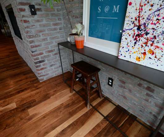
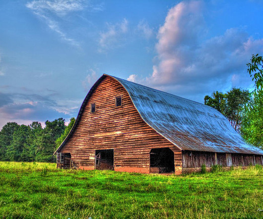
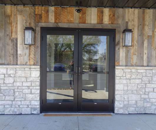
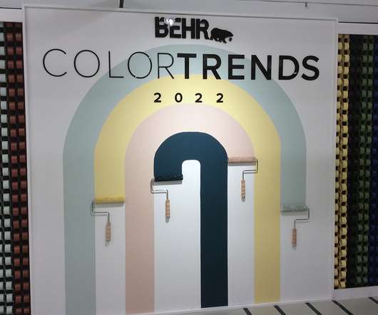
2022 TRENDING COLORS

Elmwood Timber

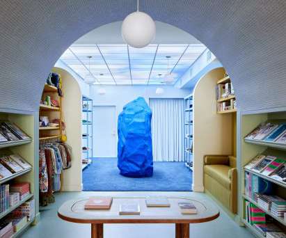
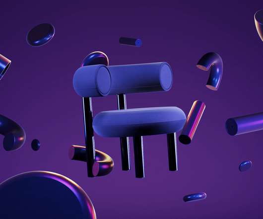
Let’s ring in the new year with a beautiful fresh color option for designers, builders, architects and decorators! COLOR HARMONY. Elmwood’s favorite palette option is formally called “Color Harmony” by Pantone. Since then, it has become the standard language of colors as defined in the Pantone code. CENTER STAGE.

Color 82
article thumbnail

The Art of Reclaimed Wood: Bringing Back Life

Elmwood Timber

This also helps ensure a more uniform surface color and finish in the end material. In other cases, different woods may be blended together to form a medley of colors and grain patterns within one area, such as a rustic flooring or paneling. For example, mixing species of oak together is a subtle way to create a contrasting design.

Art 52
Insiders

Sign Up for our Newsletter

This site is protected by reCAPTCHA and the Google Privacy Policy and Terms of Service apply.

article thumbnail

Landlords Need Reimagined Properties And Hospitality-Infused Amenities To Lure Tenants

All Work

Each decision — colors, textures, fabrics, and finishes — contributes to the larger vision. Designing with a striking color palette draws the eye inward, and incorporating various textures also adds visual contrast and uniqueness to the interiors.

Reimagine 105
article thumbnail

Wood Wall Paneling Design Ideas

Elmwood Timber

Creating an accent wall or adding some texture or a different color to the wall decor of a room has long been a recommended interior design technique for upping the style in both homes and commercial spaces. . Wood accent walls have helped take this to another level, adding warmth and a rustic look to rooms as well as interest and color.

Color 74
article thumbnail

NeoCon 2021: Pastels, Relaxation, and Nature

Retail Works Inc

They racked up over 10,000 steps each, while seeing all of the trends, color reports, and new product launches that filled the 10 floors of the Mart. Once again, the line between residential and commercial design has blurred, and a more soft pastel color palette took the forefront. Their design is reminiscent of a popsicle.

Color 98
article thumbnail

Choosing the Best Materials for Visual Merchandising Concepts in Luxury Retail Stores

Retail Focus

Dutch contemporary artist Levi van Veluw , the creator of inaugural window display art for Hermès’ at Nordiska Kompaniet, said, “the window becomes an experience.” A sense of contrast . The color combination of beige and metallic tones brings masculinity to match the brand’s image. Easy to obtain .

article thumbnail

Common Retail Signage Mistakes to Avoid

Creative Displays Now

You want your company’s sign to stand out among the competition, but it’s best to choose a font that is simple, artful and easy to read rather than the fanciest font you can come up with. Awkward or Difficult to See Contrast. The lettering needs to contrast with the background so your customers can read it.