Remove Balance Remove Color Remove Contrast Remove Promotion
article thumbnail

Best Practices for Setting Up Retail Displays

Creative Displays Now

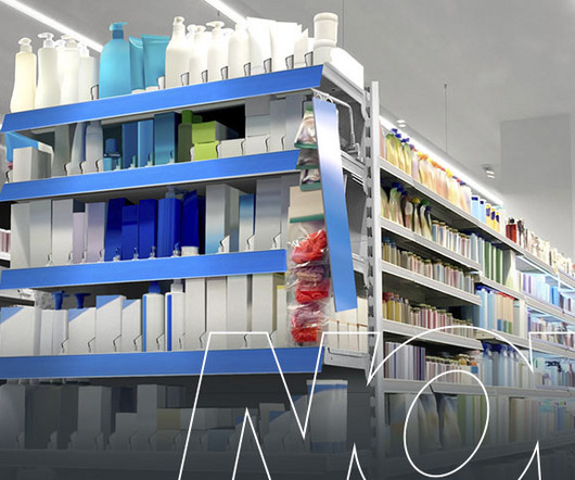
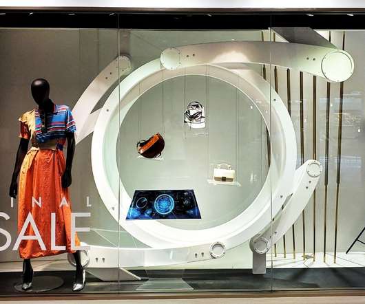
Establish Your Goals If you promote or sell multiple items, you must decide what to prioritize in your current displays. Learn what colors resonate with them, what drives their purchases and how to incorporate this information into your display. You can also consider a brand-new display with updated colors and graphics.

Display 78
article thumbnail

Choosing the Best Materials for Visual Merchandising Concepts in Luxury Retail Stores

Retail Focus

Fabric textures can influence the perception of colors, so creative visual merchandising concepts select and combine different fabrics with building a story for retailers. A sense of contrast . The color combination of beige and metallic tones brings masculinity to match the brand’s image. Easy to obtain . Longevity .

Insiders

Sign Up for our Newsletter

This site is protected by reCAPTCHA and the Google Privacy Policy and Terms of Service apply.

article thumbnail

Common Retail Signage Mistakes to Avoid

Creative Displays Now

If you’re using your sign to promote a sale or upcoming product release, see what information will remain relevant for another time. Awkward or Difficult to See Contrast. When choosing the color scheme for your sign, make sure it balances complementary and contrasting colors to form a visually appealing harmony.

article thumbnail

Siete’s astronomical aesthetic is all about sculpture and space

Design Wanted

It is also aesthetically pleasing, says Fernandez, “[It] is like a sculpture, it is attractive, simple, dynamic and balanced.”. A contrasting touch-sensitive, stainless steel switch connects the two elements which “ represents the human relationship between Earth and space,” says Fernandez. It’s a visual and tactile experience.”

Space 126
article thumbnail

2022 Workplace Trends: Sensory Intelligence

All Work

When entering a lobby or transition space, considerations should be made to provide clear lines of sight for easy navigation, pops of color for interest, and imagery to reinforce branding and aid in wayfinding. Varied ceiling heights, patterns and pops of color create areas of focus, social cues and engagement.

Color 68
article thumbnail

How Sensory Design Can Create Efficient Workplaces

All Work

Workplace leaders should support this transition by creating environments that promote wellbeing, concentration, and creativity. As a result, workplace leaders must consider and support the individual needs of their employees by creating environments that promote wellbeing, concentration and creativity. Around 17% of the U.S.

Design 58
article thumbnail

How Multifamily Design Can Inform The New Office

All Work

If you’re familiar with the term ‘work-life balance’, it won’t surprise you to know that workspace design frequently borrows ideas from the multifamily world. Having become accustomed to a greater work-life balance and flexible schedule, employees need a greater “why” if they are going to make the trip back.

Design 58