Remove Art Remove Contrast Remove Light Remove Texture
article thumbnail

Neri&Hu creates "wooden hut" and "cave-dwelling" interiors for Shanghai stores

Dezeen

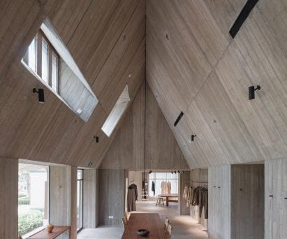
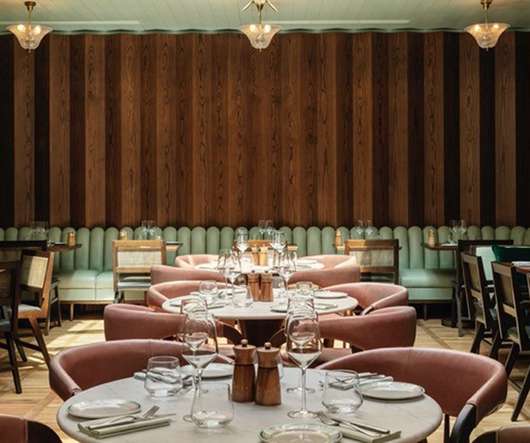
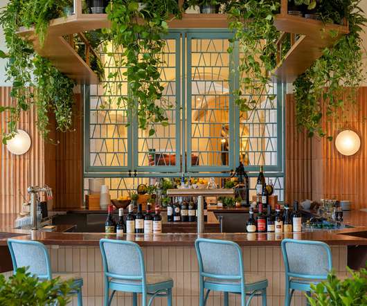
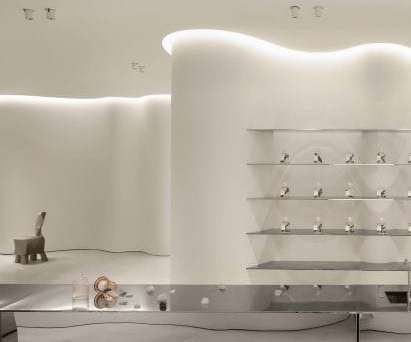
Handmade ceramic floor tiles with muted colours were used throughout the space, referencing the warm and natural textures of the linen products that the brand is known for. In contrast, Neri&Hu created a cave-like shelter made of concrete for the 200-square-metre Woven Moonlight. The photography is by Pedro Pegenaute.

article thumbnail

Tutto Bene references Streamline Moderne in tiny New York eyewear store

Dezeen

Charlotte Perriand's LC8 stool is among the vintage furnishings The functional and precisely detailed design of Cubitts' spectacles provided the main inspiration for the store, which also references the streamlined forms of Streamline Moderne – an aerodynamic offshoot of art deco that emerged in the 1930s. "We

Insiders

Sign Up for our Newsletter

This site is protected by reCAPTCHA and the Google Privacy Policy and Terms of Service apply.

article thumbnail

Landlords Need Reimagined Properties And Hospitality-Infused Amenities To Lure Tenants

All Work

Each decision — colors, textures, fabrics, and finishes — contributes to the larger vision. Designing with a striking color palette draws the eye inward, and incorporating various textures also adds visual contrast and uniqueness to the interiors. Image courtesy of Tom Minieri.

Reimagine 105
article thumbnail

Bluehaus designs ergonomic and inviting interiors for Credit Suisse’s new Riyadh office

Design Middleeast

Paired with high stools in a contrasting green, it offers a convenient spot for brief meetings or individual work. “Our vision for Credit Suisse’s Riyadh office was to create an atmosphere where natural colours and finishes provide a backdrop for thoughtful bursts of colour and texture.

article thumbnail

Interiors inspiration: Design Week’s pick of spaces using natural materials

Design Week

At reception, a large-scale art piece presents an abstracted graphic interpretation of the lunar calendar. In the wider lobby and elsewhere, art pieces are strategically placed to evoke water reflections. An industrial theme runs throughout, and textures of brass and concrete are used to contrast with softer furnishings.

article thumbnail

Treat, JKF International Airport | 51st International Design Competition Store of the Year

Retail Design Institute

The material palette is layered, textured and warm with the use of tiles, plaster-look wallcoverings, fabrics, and colors like rose beige, brown, and bronze – a beacon of warmth in contrast to surrounding retail. lighting); Ana Maria Designs, Newport Coast, Calif. signage, art frames); Schluter, Plattsburgh, N.Y.

Design 93
article thumbnail

Interiors inspiration: Design Week’s favourite new projects

Design Week

The texture and finish of the bar is a reference to the front doors of traditional Copenhagen homes, the studio says. In contrast to the dark burgundy colour palette of the bar, the inner restaurant features a neutral colour scheme. Each is then finished with custom designed lighting, seating and screens.