Remove Architecture Remove Flow Remove Layout Remove Space
article thumbnail

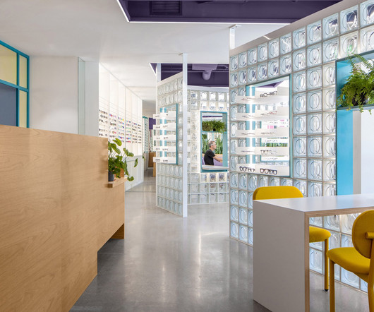
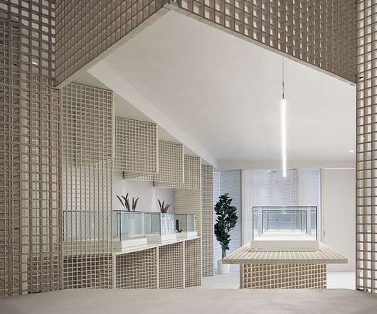
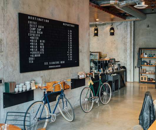
Glass blocks divide Eye Eye optical store by Best Practice Architecture

Dezeen

Local studio Best Practice Architecture has used punchy colours, glass bricks and dichroic glass inside an optometry store in Seattle 's Leschi neighbourhood. For Eye Eye 's second location, founder Will Pentecost got back in touch with Best Practice Architecture , which had completed the brand's first brick-and-mortar store back in 2015.

article thumbnail

Hermès reopens its store in Pacific Place Mall, revealing a unique, spacious design and reaffirming its history with Hong Kong

Retail Focus

Awash with light and recast in a warm, welcoming colour palette, the new store boasts a spacious layout where one can discover the sixteen métiers of the house and the spirit of savoir-faire and innovation at the heart of Hermès.

Layout 246
Insiders

Sign Up for our Newsletter

This site is protected by reCAPTCHA and the Google Privacy Policy and Terms of Service apply.

article thumbnail

Mecca for mums: How The Memo is disrupting the baby goods market

Inside Retail

There was a pin-drop moment, where I was like, ‘There isn’t a Mecca in the baby space’,” Casey recalled. All about the flow. flow was really important,” Casey said. My favourite part of the store is the health and recovery space, which you probably won’t find in the traditional retailers. New products and services.

Marketing 246
article thumbnail

Pierre Yovanovitch opens design gallery in New York City penthouse

Dezeen

Recognisable designs including the iconic Bear Chair fill the 10,000 square feet (930 square metres) of gallery and office space on the penthouse level of 555 West 25th Street. Throughout, exposed ceiling joists and ductwork are paired with dark wood flooring and whitewashed brick, typical of a New York loft space.

Design 112
article thumbnail

Aedas-designed Huanggang skyscraper redefines the Shenzhen urban landscape

Design Middleeast

A simple fluid architectural form is adopted which signifies flowing water, while the cantilevered canopy at the tower’s entrance signifies the splashes. The vertical lines of the façade pour from the crown to the lobby, unifying the architectural language from top to bottom.

Design 59
article thumbnail

Standout stores: New flagships, pop-ups and openings that caught our eye 

Inside Retail

Spanning two floors, the 1103sqm retail space features distinct areas dedicated to specific product categories. The unconventional flow, leading customers left instead of right, sets the experimental tone. Open for just 12 weeks, the architecturally designed store reflects Thankyou’s commitment to reimagining retail.

Artistic 130
article thumbnail

WGNB creates minimal monochrome SVRN store in Chicago

Dezeen

A variety of monolithic furniture pieces direct the flow of movement around this fashion boutique in Chicago, designed by South Korean studio WGNB. The space for lifestyle brand SVRN is intended to highlight the products for sale as artworks and ideas, rather than simply as garments.