Remove Balance Remove Color Remove Contrast Remove Form
article thumbnail

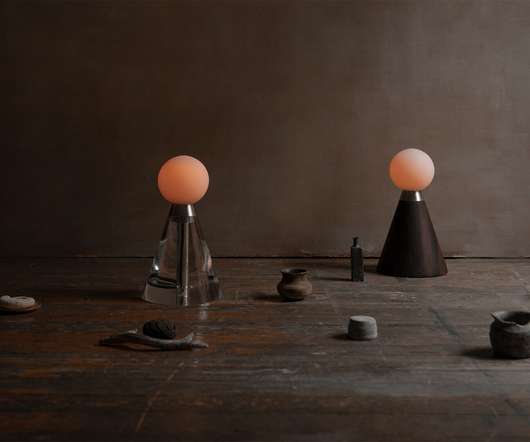
+GLASS ??transforms space into a play of colors and reflections

Design Wanted

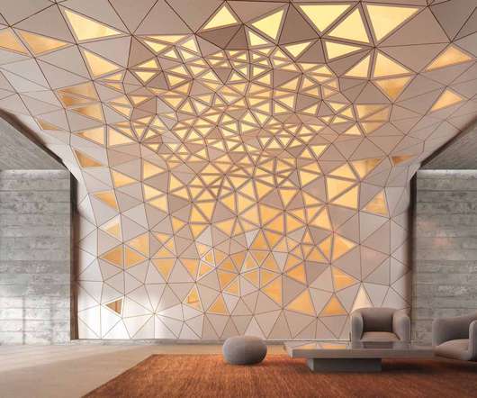
Presented in three color and texture combinations, +GLASS is a series of artifacts made through manual and machine processing. The two products blend perfectly, in a synergy of balance between full and empty, allowing you to create infinite composition possibilities, customizable in colors and shapes.

Color 52
article thumbnail

Best Practices for Setting Up Retail Displays

Creative Displays Now

Setting up displays in stores is an art form combining creativity and strategic planning. Learn what colors resonate with them, what drives their purchases and how to incorporate this information into your display. You can also consider a brand-new display with updated colors and graphics.

Display 78
Insiders

Sign Up for our Newsletter

This site is protected by reCAPTCHA and the Google Privacy Policy and Terms of Service apply.

article thumbnail

Choosing the Best Materials for Visual Merchandising Concepts in Luxury Retail Stores

Retail Focus

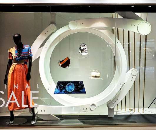
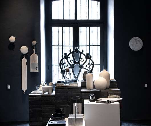
Metal has a broad application of surface effects and metallic tones formed through various methods such as electroplating and coating that bring a wow factor to the visual display. A sense of contrast . The color combination of beige and metallic tones brings masculinity to match the brand’s image. Easy to obtain .

article thumbnail

Set the Scene

VMS

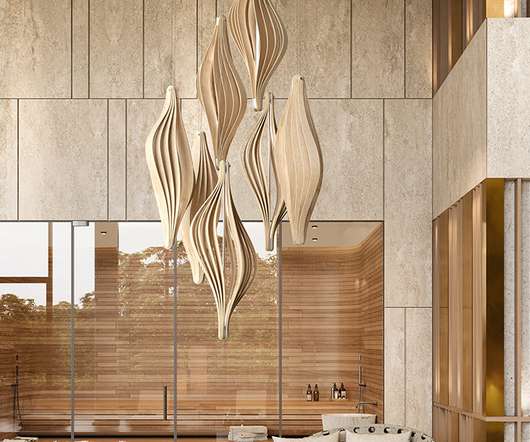
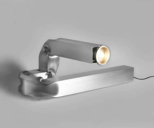
Swooping shaped lighting fixtures are bringing a soft edge to retail and restaurant interiors this year, creating balance in relation to angular and digital features. When it comes to colors, organic shades and pastels abound. Customizable in a range of colors and fabrics, it comes in small, medium and large sizes.

article thumbnail

Common Retail Signage Mistakes to Avoid

Creative Displays Now

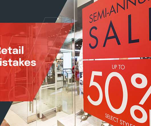
Awkward or Difficult to See Contrast. When choosing the color scheme for your sign, make sure it balances complementary and contrasting colors to form a visually appealing harmony. The lettering needs to contrast with the background so your customers can read it.

article thumbnail

Siete’s astronomical aesthetic is all about sculpture and space

Design Wanted

Last year, they merged to form Siete, which in Spanish means seven, a name they chose because of its symbolic value. It is also aesthetically pleasing, says Fernandez, “[It] is like a sculpture, it is attractive, simple, dynamic and balanced.”. Mexico is a place full of contrast, elements and culture.

Space 126
article thumbnail

Morici reveals production processes behind its Tellux collection of luxury boxes

Design Wanted

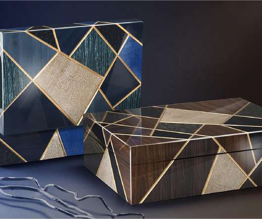
Juxtaposing precious woods of different textures and colors, the collection conceptualizes nature within a dynamic framework. The intention was to transform scenery into a graphic language informed by the company’s mastery of color and its ability to create striking, three-dimensional patterns. Step Three: Painting.

Texture 98