Remove Art Remove Artistic Remove Color Remove Harmony
article thumbnail

2022 TRENDING COLORS
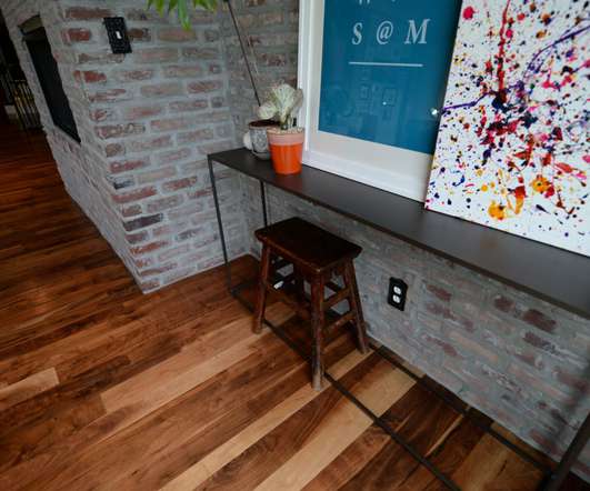
Elmwood Timber

Let’s ring in the new year with a beautiful fresh color option for designers, builders, architects and decorators! Referred to as ‘The Star of the Show’ Very Peri wins first prize with its harmonious symposium in cool blue fashion with just a hint of violet undertones. COLOR HARMONY. ARTISTIC ACCOMPANIMENT.

Color 82
article thumbnail

Yvonne, a TwentyOne06 interior design project, brilliantly reflects Dubai’s maximalist spirit

Design Middleeast

However, Yvonne defies convention and emerges as a vibrant and daring playground for those who adore bold colors and unapologetic nostalgia. ” Yvonne’s transformation is deeply rooted in meticulous research, focusing on prominent trends such as maximalism, bold use of color, and daring nostalgia.

Interior 105
Insiders

Sign Up for our Newsletter

This site is protected by reCAPTCHA and the Google Privacy Policy and Terms of Service apply.

article thumbnail

More on the Floor

VMS

In the coming year, look for more artist and manufacturer collaborations that celebrate both the handmade and one-of-a-kind despite the rise of Barbiecore. In addition, the company offers custom color matching. Features a blend of classic elements, figurative drawings and visual complexity accentuated by bold colors.

Color 52
article thumbnail

The Pride Flag: a colourful history of a design icon

Design Wanted

It had eight colours and was designed by the artist and queer activist Gilbert Baker who was commissioned to design something that could represent the LGBTQ community by his friend Harvey Milk, the first openly gay elected official in California. The flag would later be simplified to become the six-tripe version , which is mostly used today.

Design 98
article thumbnail

Common Retail Signage Mistakes to Avoid

Creative Displays Now

You want your company’s sign to stand out among the competition, but it’s best to choose a font that is simple, artful and easy to read rather than the fanciest font you can come up with. When choosing the color scheme for your sign, make sure it balances complementary and contrasting colors to form a visually appealing harmony.

article thumbnail

How to Create a Better Working Environment for Your Retail Staff: 6 Simple Ideas

RetailMinded

Facilitate a Comfortable and Aesthetically Pleasing Workspace Just as an artist requires a vibrant studio, your retail staff thrives in an environment that’s both comfortable and visually engaging. Invest in ergonomic furnishings and infuse the space with color and life, considering elements like natural lighting or art.

Harmony 52
article thumbnail

Highlights from the LIT Lighting Design Awards 2021

Design Wanted

It forms part of its Malevich collection, a series based on primary shapes and named after the avant-garde artist whose concept of suprematism inspired its aesthetic. The simplicity and the accuracy of the artist’s technique is exceptionally clear,” explains Atris founder Dimi Litz. “I Serif by Kuzco Lighting, Pendant Lighting.

Light 98