

Add to collection
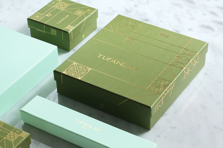
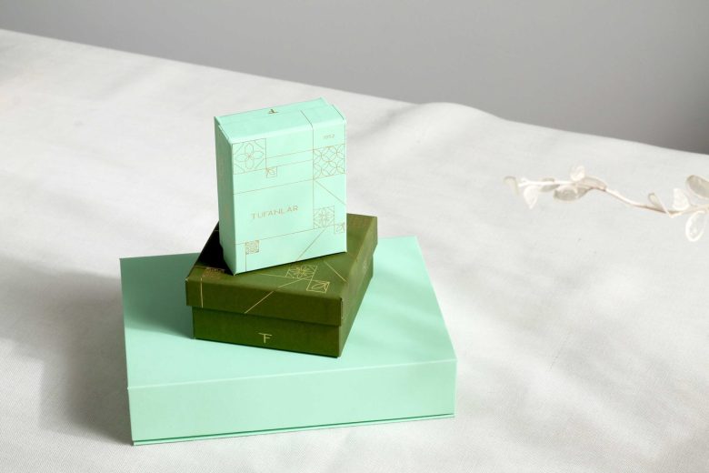
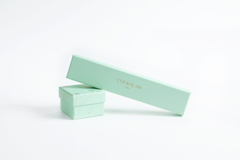
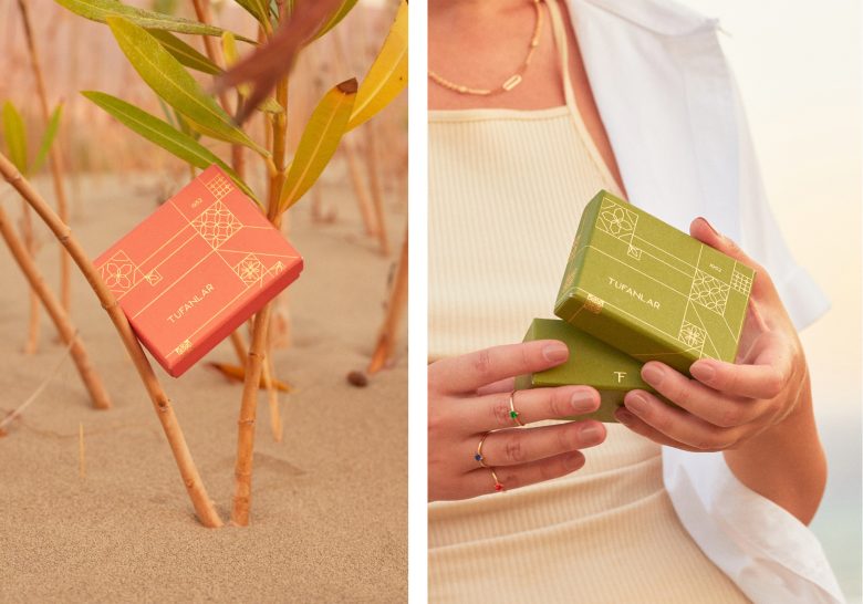
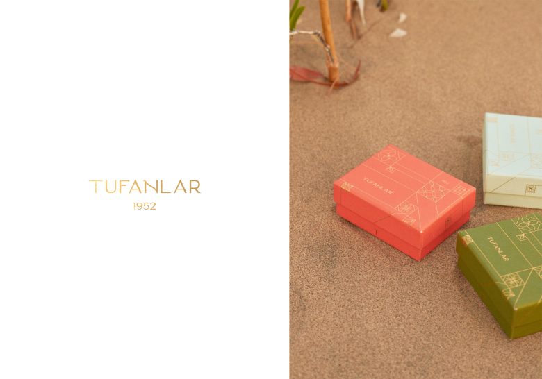
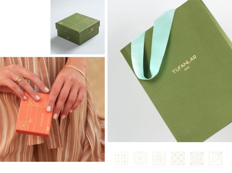
Tufanlar is a high-end luxury jewelry brand based in Fethiye since 1952. They asked for a rebranding as they are quite old in the industry. We redesigned the brand from the scratch to be more minimal, elegant and also to be timeless.
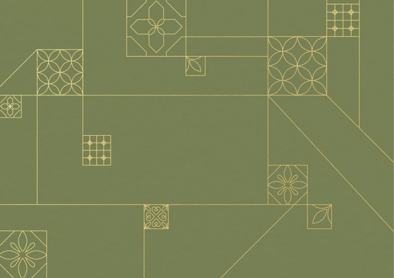
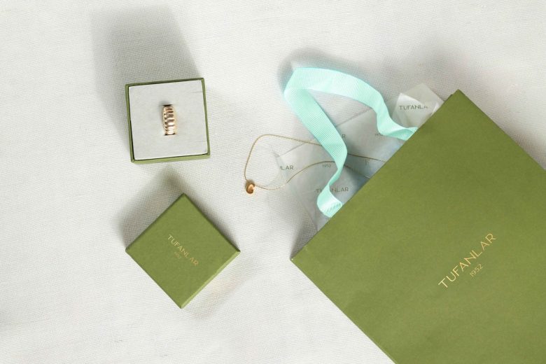
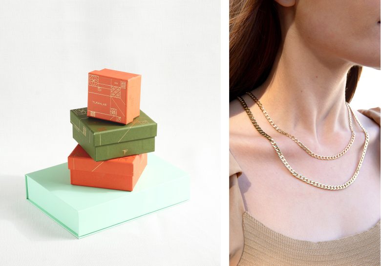
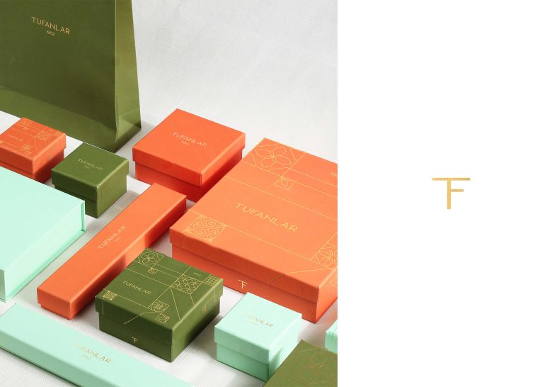
We inspired from the Mediterranean tile motifs while creating the main graphic elements of the brand. By modernizing the motifs we tried to give a traditional and a modern feeling at the same time. It was one of our main challenges. While creating the color palette, we inspired from the location of the brand. Thus we assigned 3 colors: mint green, orange and khaki green. Mint green represents the sea, orange represents the sunset and khaki green represents the nature. We used gold foil details in logo and graphic elements which makes the identity looks more elegant. We chose a san-serif, minimal and feminine logotype for the brand which works well with the pattern we created. To balance the visuals we used the pattern on some of the boxes, for the others we preferred a simple typography. Overall it was a challenging but a very fun project to be involved in.
Hope you enjoy it as much as we do!
Designed by Salt and Sugar Creative Studio


Add to collection