
Stationery brand Papier’s new visual identity is inspired by the “power of the blank page”
Design studio Ragged Edge has rebranded the London stationery company with a logo inspired by printers’ marks.
London-based studio Ragged Edge has crafted the new visual identity for Papier, as the stationery brand begins its expansion into the US.
The updated branding for the direct-to-consumer (DTC) company includes a new marque, bespoke wordmark as well as supporting materials such as a promotional magazine.
Papier was founded six years ago in London’s Soho, and offers personalised stationery such as cards, notebooks, diaries and planners.
“The rebrand aimed to set Papier up for its next phase of growth, particularly in the US,” Ragged Edge co-founder Max Ottignon says.
“But just as important, we aimed to get people to engage emotionally with the brand – and stationery itself – beyond the aesthetics of the cover,” he adds.
“The transformative power of the blank page”
The inspiration for the new look came from the idea of “the transformative power of the blank page,” Ottignon says. The design team began to think of Papier as an “emporium of magic, full of wondrous possibility,” he adds.
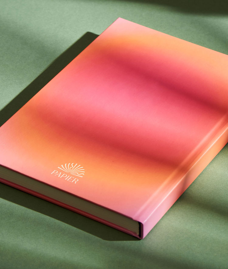
This has been brought out in the details from the packaging to the tone of voice, he explains. The new marque – which depicts an open book – seeks to be “bold and distinct”, Ottignon says, avoiding clichés associated with the tech or DTC sector.
Printers’ marks provided a visual inspiration, he explains, but the design was also about “conveying the magic inside the pages of Papier”.
Ragged Edge also designed a typeface for the wordmark, inspired by the marque. “We wanted to capture that same combination of elegance, with a touch of magic”, he says.
It’s designed to work across print and digital, according to Ottignon. The new packaging also features the updated designs.

The colour palette plays off Papier’s products, with primary shades that reference paper and ink – “an off-white and a soft black”, Ottignon says. The secondary palette seeks to add “a hint of colour to backgrounds without ever competing with the vibrancy of the producst themselves,” he adds.
The studio has also created a graphic pattern – built from the marque – that was inspired by optical illusions. Ottignon says: “What could be more magical than the design on the packaging starting to move before your very eyes?”

Papier has an online magazine called The Fold, where creatives discuss their passions and the “power of the (hand) written word”, Ottignon says. For the update, Ragged Edge designed a physical version of The Fold.
“For a brand that combines the digital with the physical, a printed manifestation felt like the natural next step,” he adds.
What do you think of Papier’s rebrand? Let us know in the comments below.
Read this next
-
Post a comment


