
Design Bridge helps RHS reposition around growth
The studio drew inspiration from the typography and botanical images found in the RHS Lindley Library.
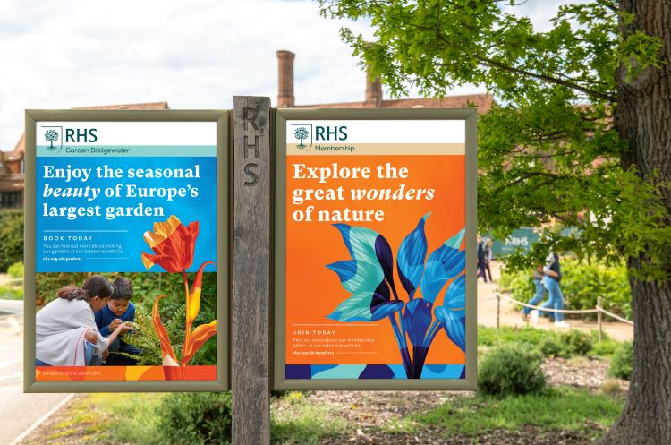
Design Bridge has partnered with gardening charity, the RHS, to coincide with the opening of its flagships event The RHS Chelsea Flower Show, which opens today.
As part of the rebrand the wordmark has been rationalised and is now written as RHS, rather that Royal Horticultural Society. It forms part of the new identity inspired by the theme: the limitless wonder of growth, which looks to bring consistency across the brand.
The pro bono rebrand aims to widen its inclusivity and appeal to people of all ages and gardening abilities, according to Design Bridge creative director Tim Vary, whose team worked alongside fellow WPP consultancy Wunderman-Thompson.
He says, “We formulated the design brief between us – Design Bridge, Wunderman-Thompson and RHS – to centre around the transformative power of gardening. We wanted to create this world that was colourful, bold and approachable through the brand.”
Wunderman-Thompson, largely focussed on the brand strategy and campaign, ‘We Speak Plant’, while RHS and Design Bridge worked collaboratively on the design elements over a 12-month period.

The RHS Lindley Library in Pimlico, where the original RHS started out, was a huge source of inspiration for the design team, according to Vary. The original tree root logo appears in mosaic tile at the library and so has been incorporated into the new logo.
Vary says that the charity’s heritage has been referenced through “trusted yet modern” typographic style and use of mixed fonts.
“There were some beautiful old books with botanical illustrations, so we used them and the charity’s heritage as a basis for the new designs,” says Vary. “We were inspired by the plant annotations and descriptions where there was a mix of different hot metal typefaces.”

Making the brand more consistent across all touchpoints was also a priority for Vary, who says a panel system was introduced to help with this. The plant imagery moves upwards through the panels, which is supposed to capture the fact that nature is never static.
To further reinforce this idea of growth, Design Bridge say that the colour palette used across the magazines and online will vary from season to season, mirroring the colours of the gardens.
Vary adds, “If you can put your thumb over the logo and still recognise the brand through, colour, illustration, typography, and type of photography, it reflects a well-constructed design system.”
Vary hopes that the new design will “celebrate the transformative power of gardening” and help underpin the RHS’s belief that gardening has the power to change lives and communities, support biodiversity and fight climate change.

The new branding is rolling out across touchpoints including brand experiences, events and destination gardens, ads, and other communications.


Love this. Great use of colour and great to see the botanicals from the RHS archives being used and brought into the modern day. A fantastic improvement on what had become quite a dull and uninspiring visual style, nice work.
Dream project and beautifully executed.