
Add to collection
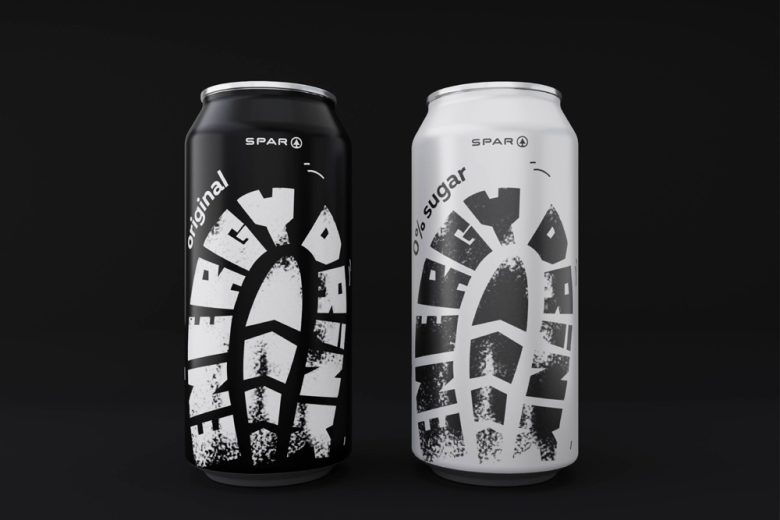
The energy drink packaging concept was developed as part of a competition organized in collaboration between the HSE Art & Design school and the SPAR federal hypermarket chain. The concept became one of the winners of the competition based on the results of neuro-marketing research at the HSE Institute for Cognitive Neuroscience.
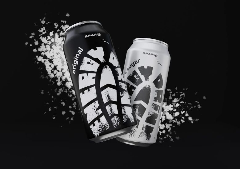
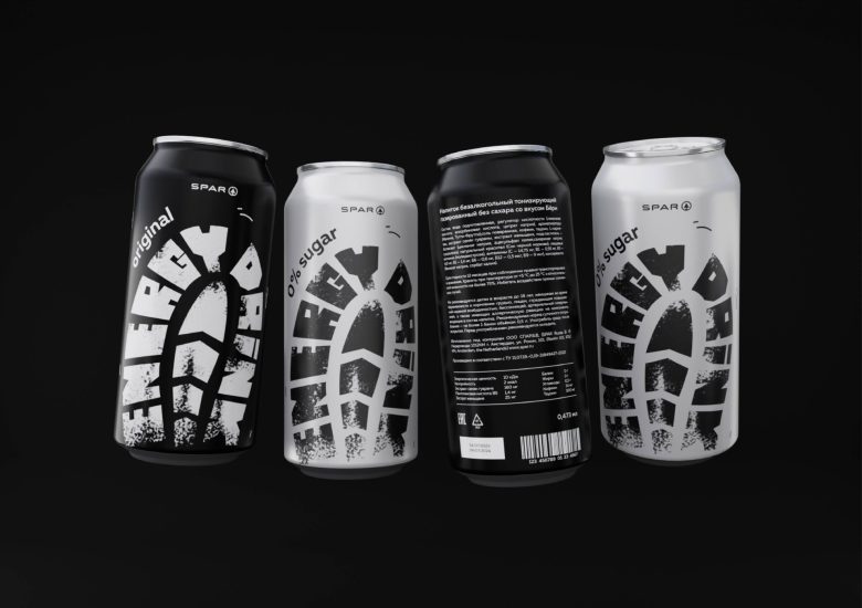
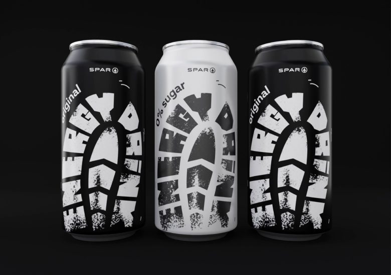
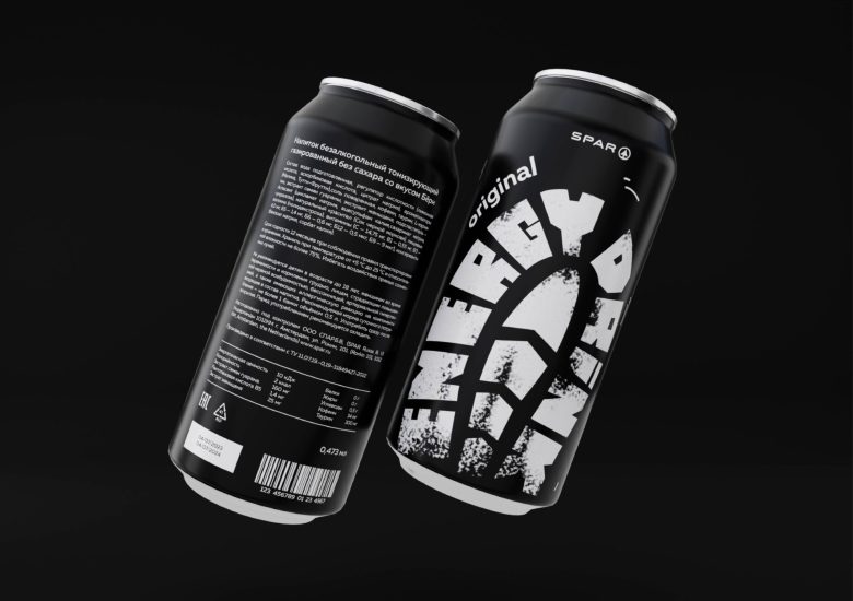
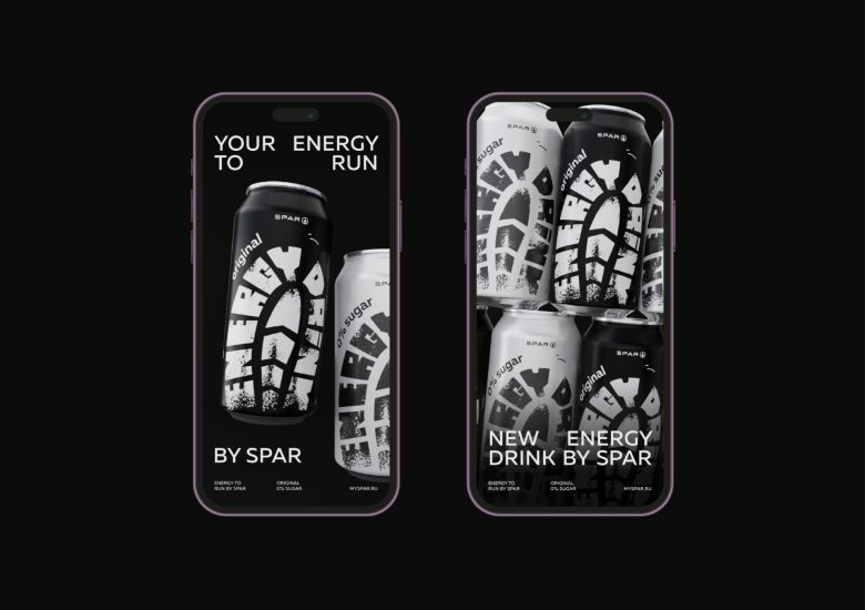
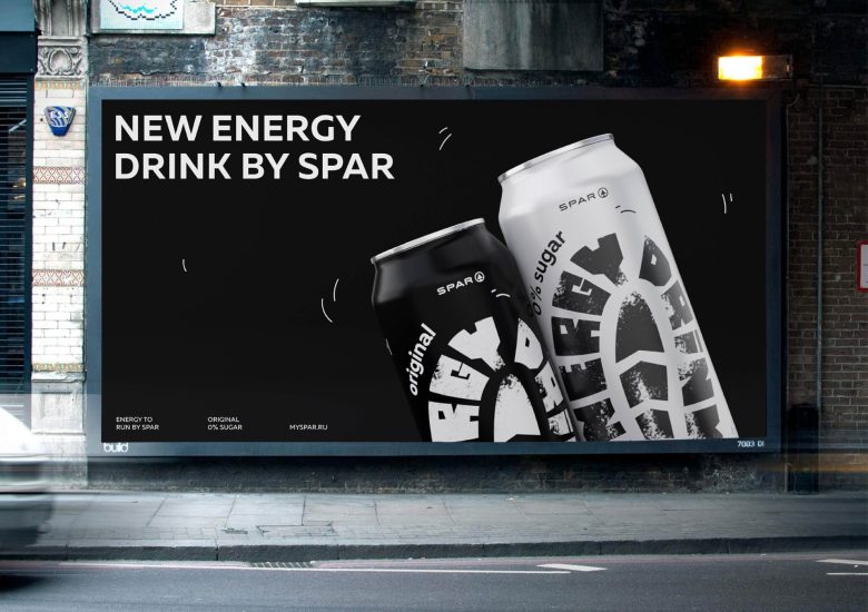
The protector imprint is drawn on the package. This is a metaphor for speed and running. The two color schemes differentiate the flavor SKUs of the energy drink.
Curator’s Insight
The footprint of a shoe with the words “Energy Drink,” right there on the package. It’s not just a clever design; it’s like a secret code that shouts “get ready to run!” It’s a clever way of showing that this drink is all about energy and speed – like a little visual pep talk.
Designed by Polina Yanvarskaya

Add to collection