

Azuma Sake by TabaHub
posted by retail design blog on 2023-01-23
Add to collection
Azuma is the leading brand in the sakes market in Brazil with a long tradition since it appeared in 1934.
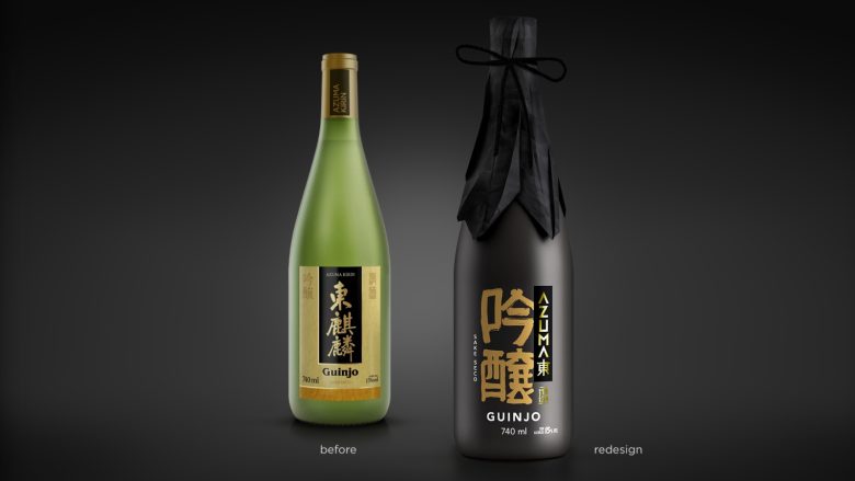
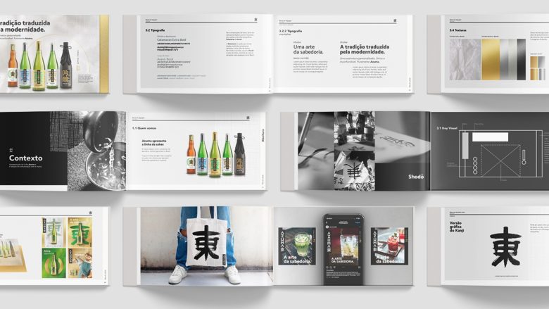
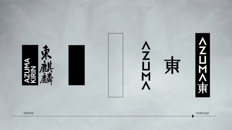
Formerly recognized as Azuma Kirin, in 2020 there was a separation from the Kirin brand. In this way, the company decided to review its visual identity and the entire packaging line to mark this new positioning.
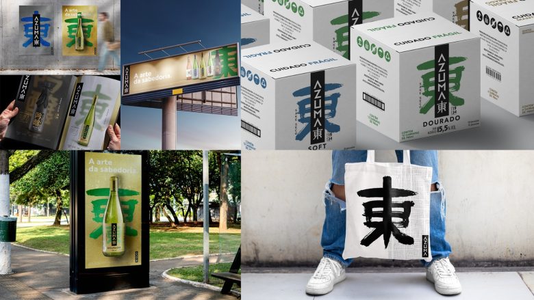
The visual solution sought a combination of tradition and modernity. The past is translated by knowledge. The modern, by behavior, identify with the new generations of sake drink lovers.
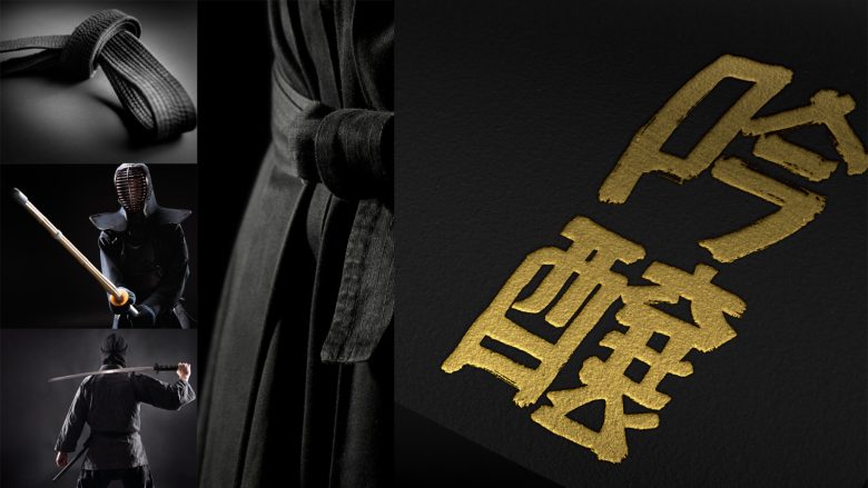
Japanese soul. Expression of tradition. Millennial wisdom. Culture of discipline and good taste. These are attributes that we brought to the new identity.
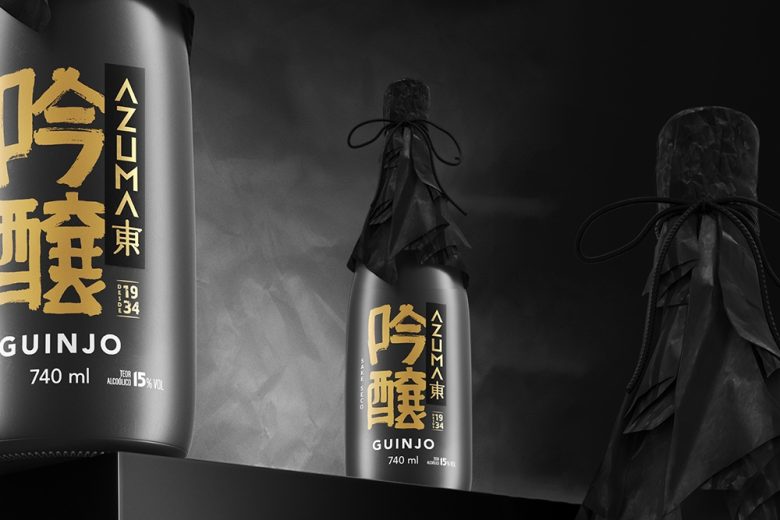
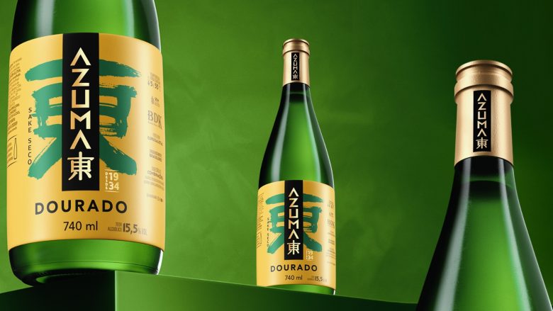
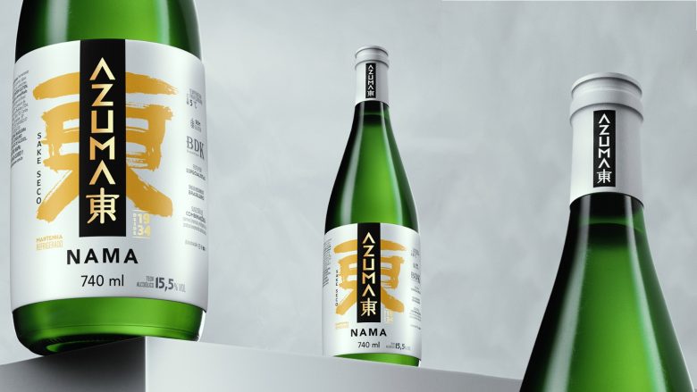
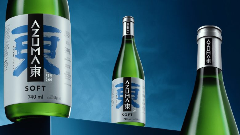
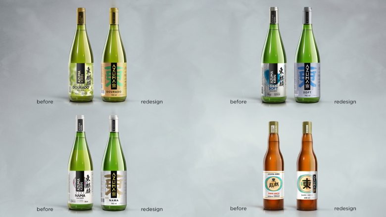
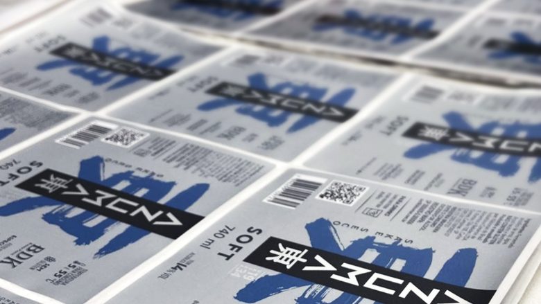
Its products are divided into 3 categories: common, superior quality (Soft, Golden, Nama), and premium (Guinjo).
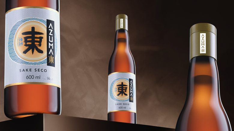
In the case of common sake, we maintained a very close formal relationship with the current packaging, as it is highly recognized on the shelf.
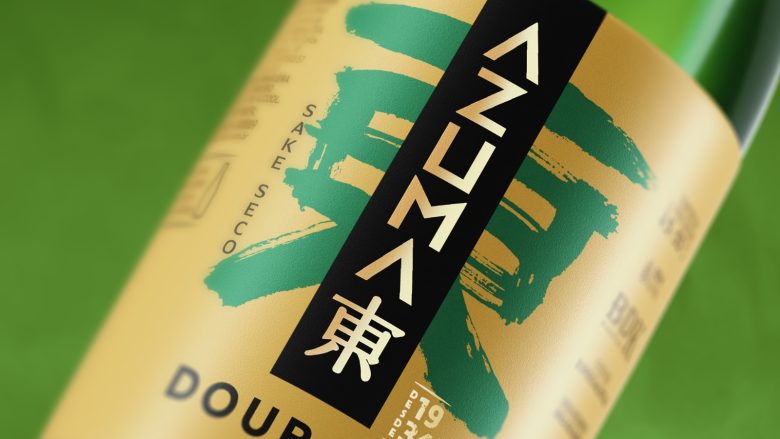
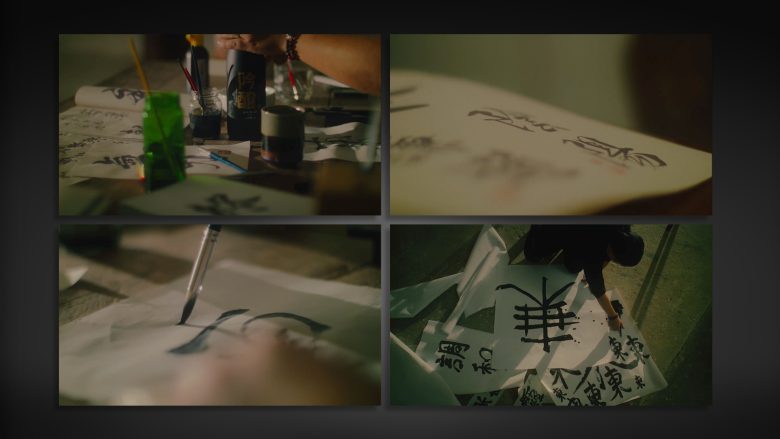
In the other lines, the change was more significant. We put a lot of emphasis on the Azuma ideogram represented in the Shodo language, developed by a specialist in traditional Japanese calligraphy. In general, we maintained a chromatic relationship with current products as a form of recognition for current consumers.
In the case of Guinjo, the rupture was total. It is the highest quality product in the line and competes with sakes imported from Japan and therefore has a high added value. The design should express the excellence of this drink. For this, we used several graphic resources to value the product: the bottle received a matte painting, for printing the brand we used hot stamping and the other information was printed on silk screen. The top received closure in black tracing paper manipulated one by one, further reinforcing Azuma Guinjo’s differential.
Add to collection