
Add to collection

PROJECT NAME: Estée Lauder Companies CIIE III
AREA: 420 sqm
LOCATION: Shanghai Convention and Exhibition Center, China
Design: dongqi Design
Design Director: JIANG Nan
Project Designers: Edoardo Nieri, Weijing He
Team: Hardy Huang, Danyi Zhang, Yijun Zhou, Yijun Yan, Ruisheng Yang, Asteria Chen, Wenjing You
Photography: Ming,Pavel Shubskiy
COLLABORATORS
Project Management & General Contractor: Max Brilliant
Structural Engineer: Lei Zhang
Client: Estée Lauder Companies
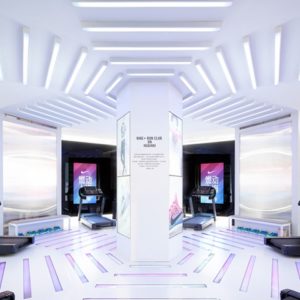
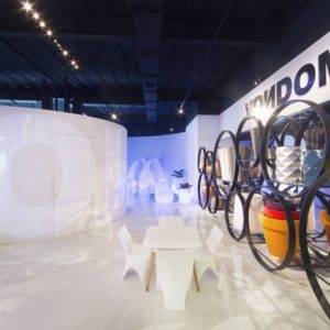
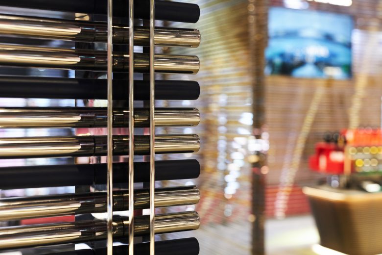
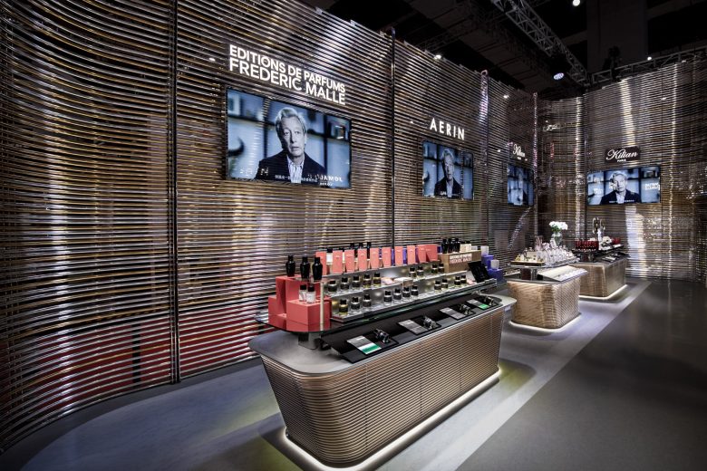
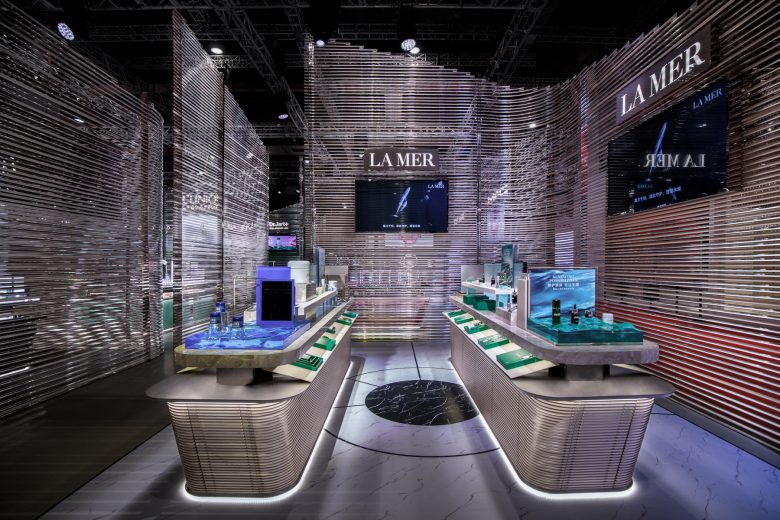
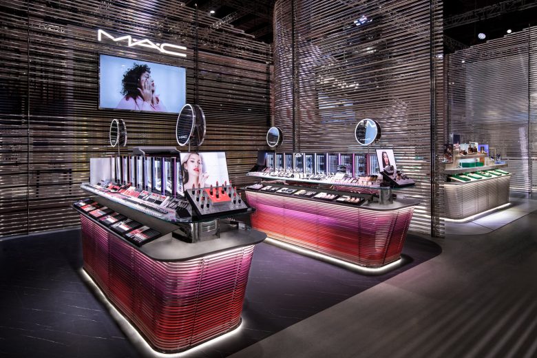
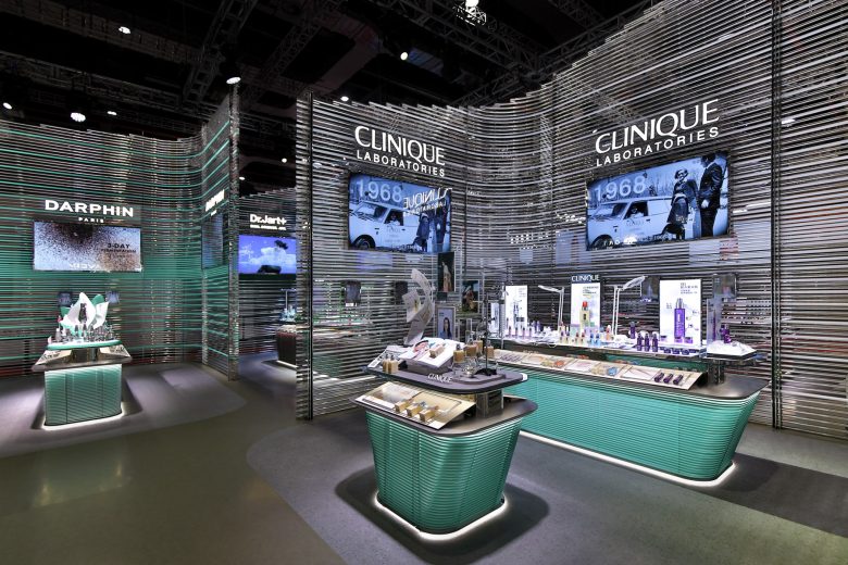
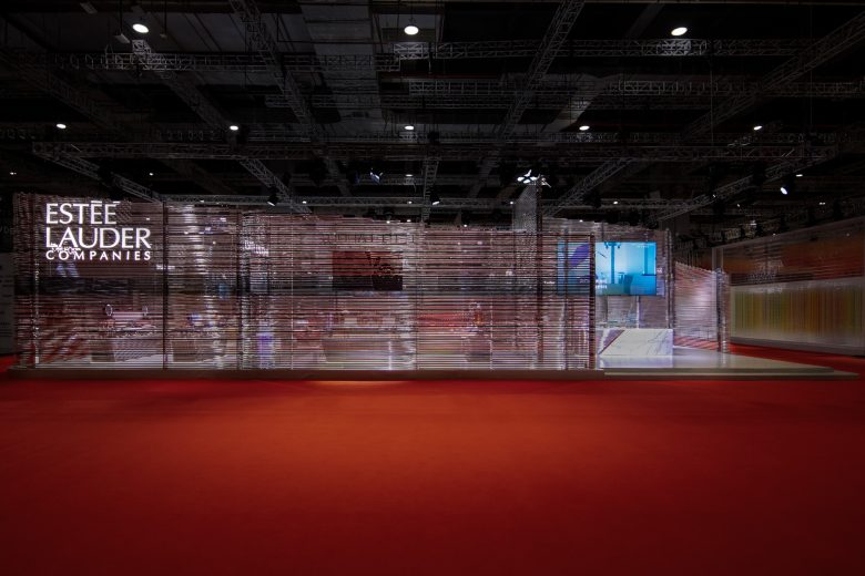
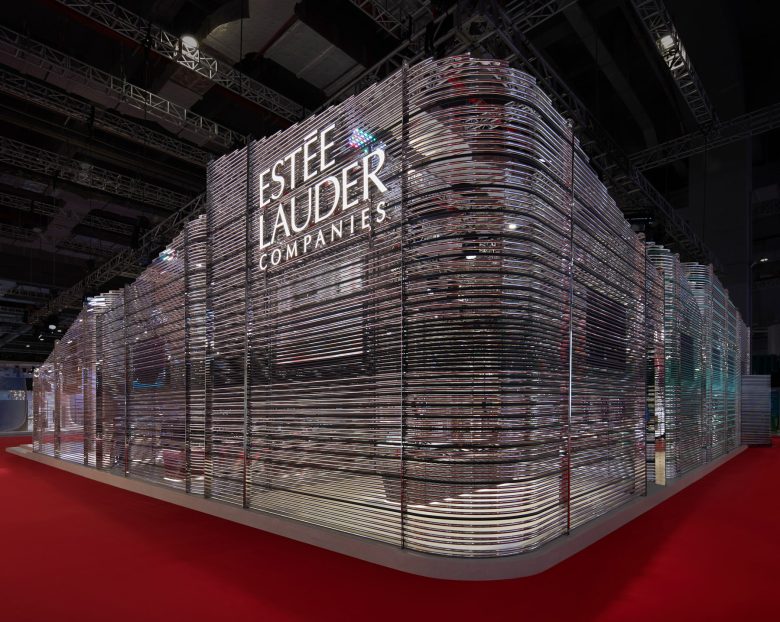
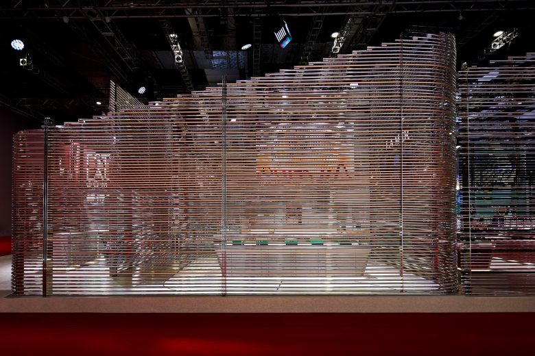
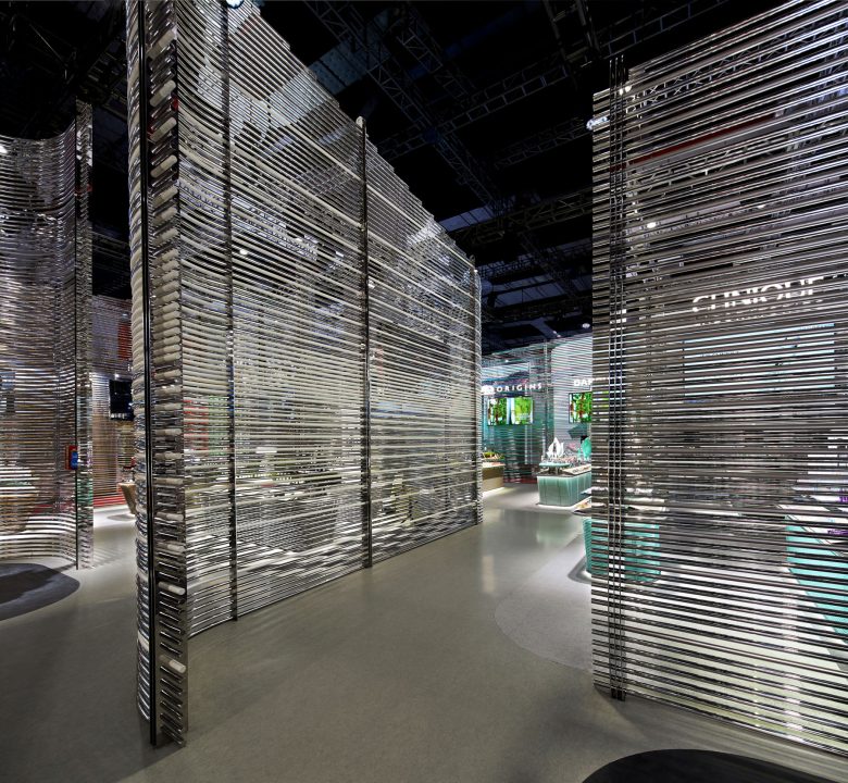
At the latest China International Import Expo(CIIE), dongqi Design designed the pavilion of the Estee Lauder Companies, wrapping the entire area of 420 square meters with 16,000 metal pipes of a height of 6 meters, a sign of unification among all the 13 classic brands that were already operating and the new brands that would soon make their debut in China. The shape of the pavilion aimed to create a unified journey that would lead visitors to discover each brand and its history when the Estée Lauder Companies was celebrating its 75th anniversary.
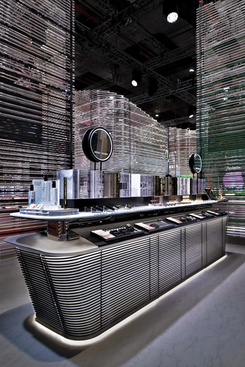
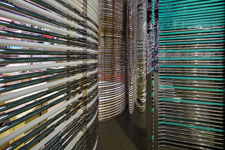
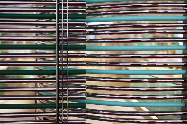
Inspired by the idea that single lines of a brush could form a perfectly harmonious painting, dongqi Design decided to build a series of “walls” with horizontal mirror pipes that would wrap all the space and give continuity to the journey.
The intent was to create a sinuous journey, where all the singularity became part of a wider reality. A key element of the design was a gap between each pipe, which created a see-through effect and enabled an ephemeral feeling — all the brands of the Estée Lauder Companies were embraced by an absence as well as a physical presence. While the pavilion looked like a solid and unified element from afar, once the visitors get closer, it will allow the permeability of the eye by creating interesting effects like the moire effect, where transparency and opaque surfaces would give an optical illusion.
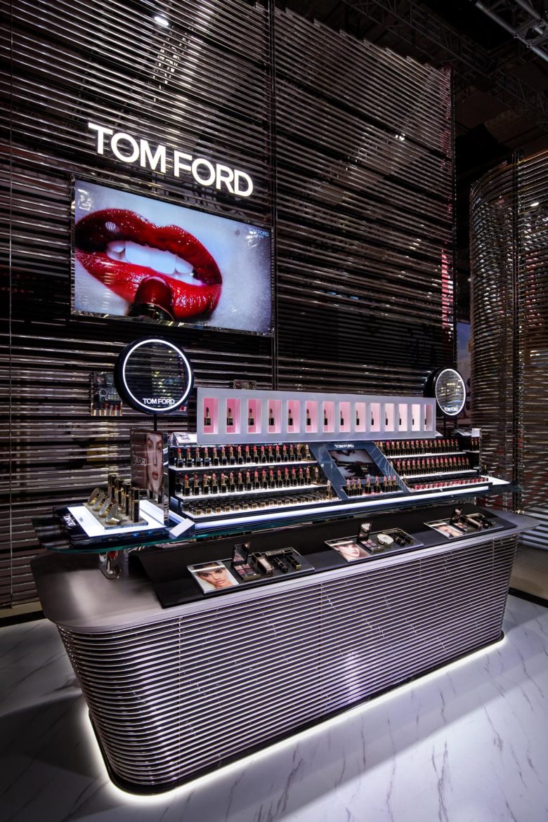
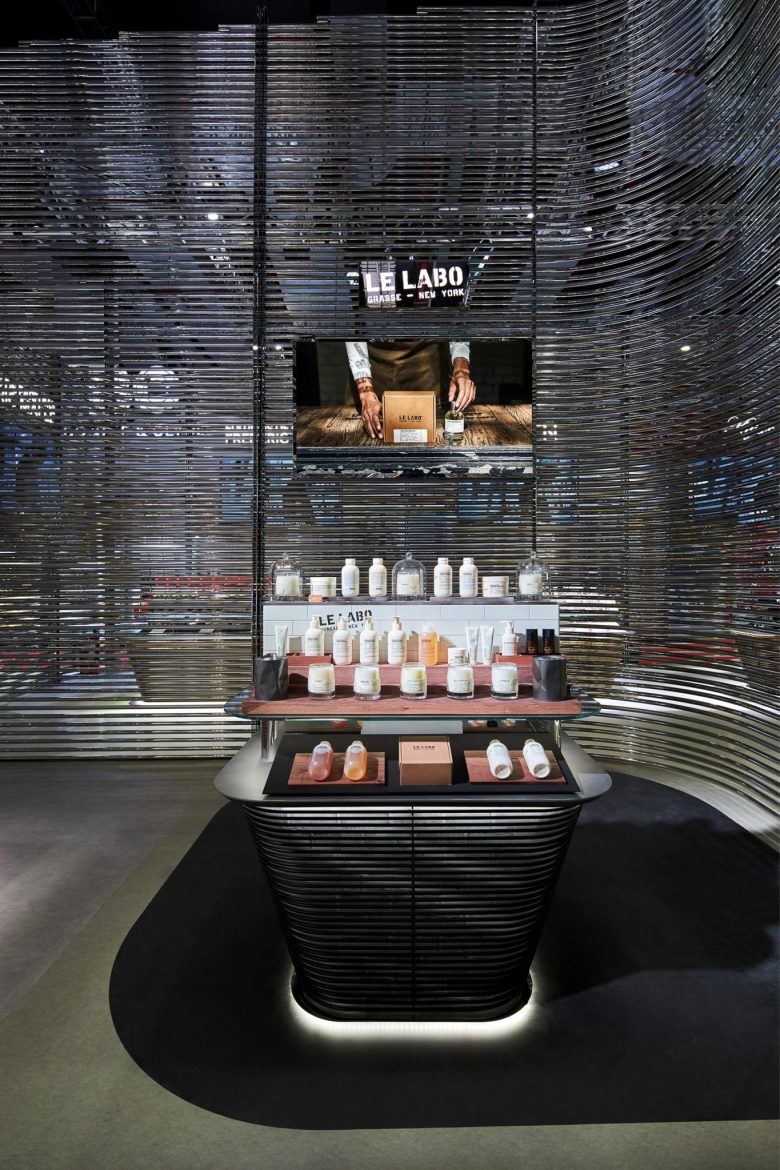
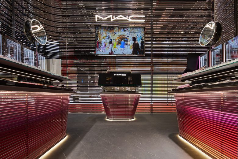
In order to distinguish each wall, a gradient of color grew from the bottom until it dissolved towards the upper part. By doing so, every brand area featured one unique color that corresponded to the brand identity. From afar, this mixture of colors created unexpected color interactions and brought the pavilion to life.
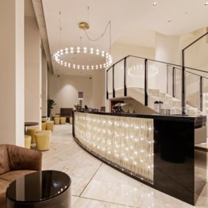
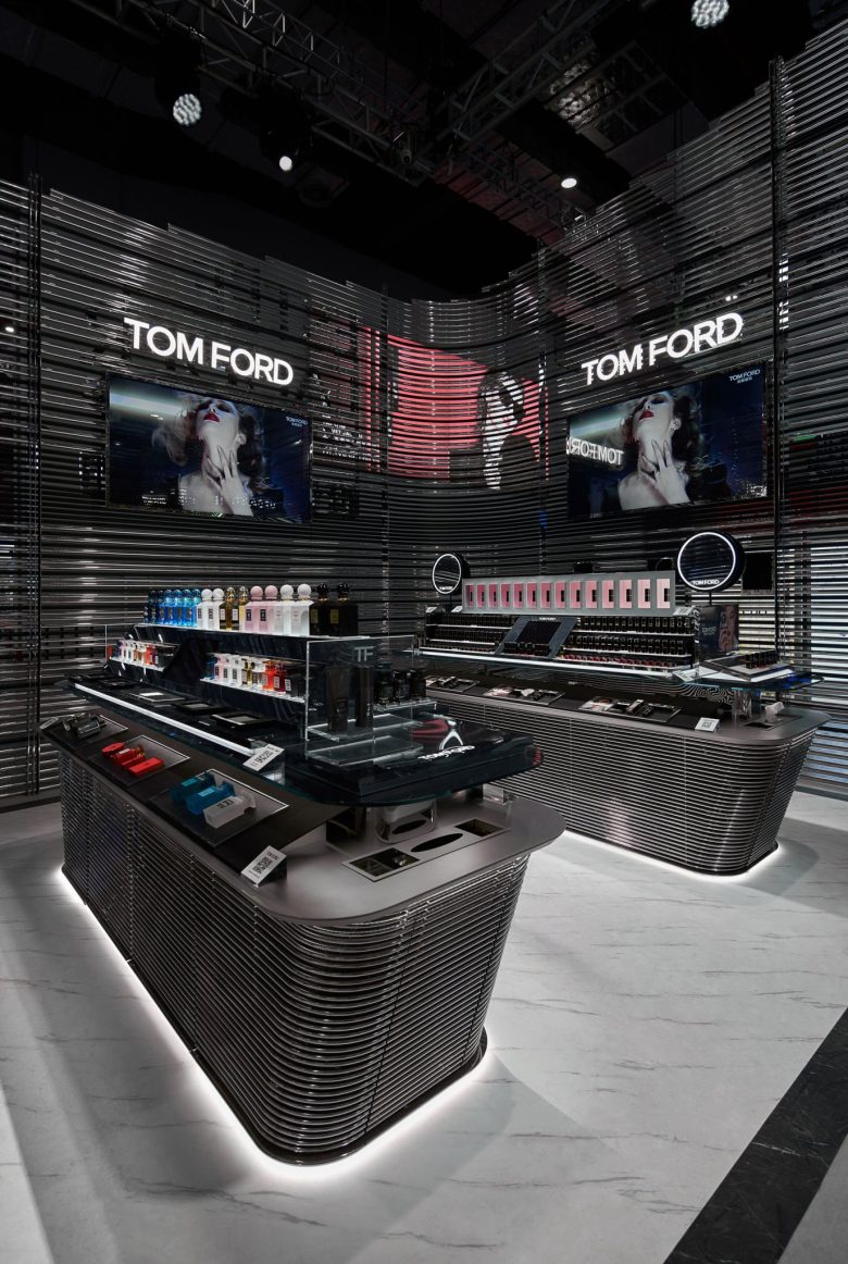
Inside the pavilion, each brand’s table was composed of two different surfaces: one in the background and one in the foreground. Consistent with the design for the entire pavilion, the surface in the foreground was composed of many metal pipes which contrasted nicely with the solid surface in the background. The complementary colors and materials were used for both surfaces to enhance their collective identity. In this way, the specific identity of each brand was highlighted by its booth and floor while the walls that wrapped different brands expressed the group identity they shared.
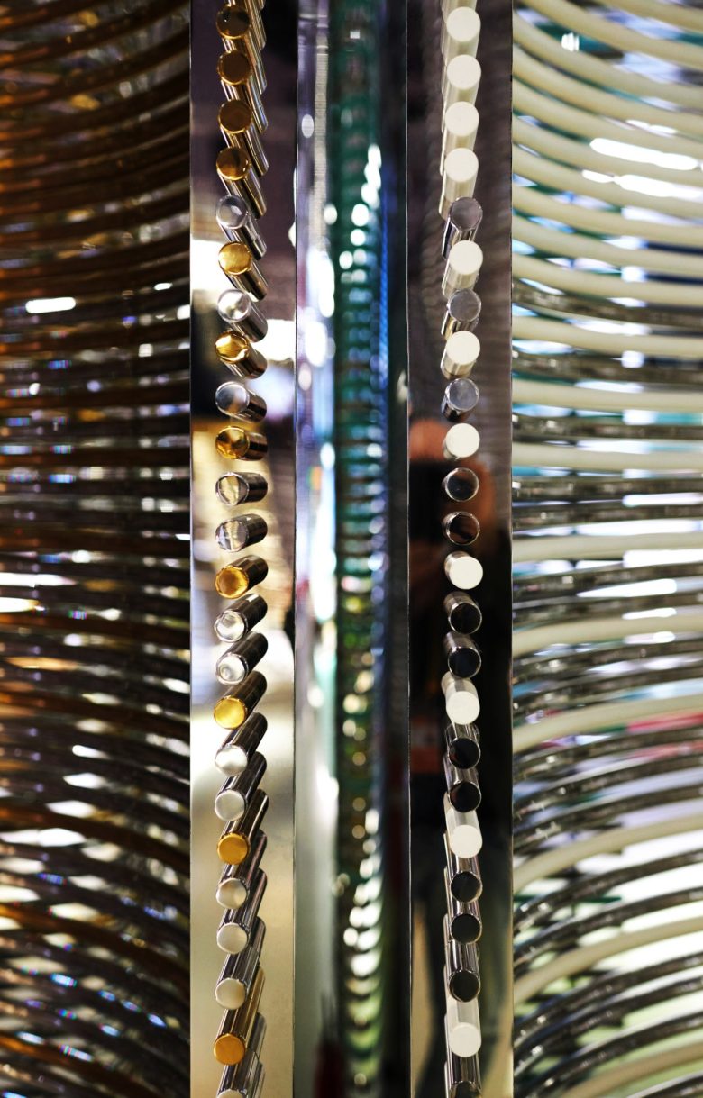
Thanks to the support of structural engineers, dongqi Design was able to develop a unique horizontal pavilion in which the amount of vertical structural systems was minimized by introducing curved pipes, whose purpose was to reinforce the stability of the pavilion. As a result, the pavilion was completed without almost any vertical support. The vertical columns present in the pavilion in fact, had been not just minimized in the amount but also in the dimension and appearance by a mirror finish. In order to hide the connections between pipes as well as between pipes and vertical columns, a hidden connection system had been developed. This was enabled by merging knowledge of dongqi Design and our structural consultant to maximize structural stability and aesthetic beauty.
Add to collection