
Supple’s Meeting Place identity features ‘M’ that looks like home
The built environment comms agency will use its new M monogram as a photographic framing device and for brand animation.
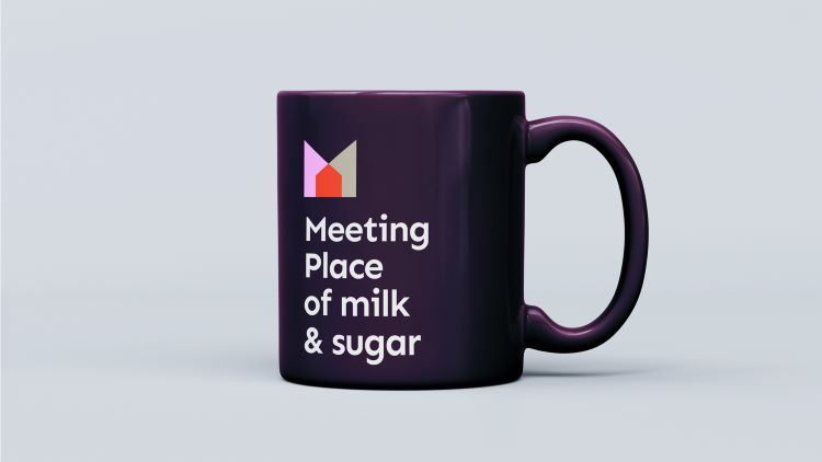
Supple Studio has designed the visual identity of communications agency Meeting Place with an animated logo which comes together to reference the M of Meeting while revealing a house, in reference to the built environment.
Meeting Place works across the built environment sector, making its target audience a mix of land promoters, asset managers and planning and development professionals. Supple won the work following a credentials pitch, after being recommended to the company by Taxi Studio. Taxi had already completed the strategy stage for Meeting Place’s rebrand and needed a smaller agency to implement it as a new identity.

According to Meeting Place’s head of design and digital Mike Jenkins, the agency’s identity had not kept pace with its rate of growth. The new identity seeks to highlight Meeting Place’s ambition to ensure the built environment is used as “a force for good”, says Jenkins.
The identity is built around the agency’s two pillars – people and progress – seeking to “show the positive change that can happen when they meet”, says Supple founder and creative director Jamie Ellul.
The iconographic logo comprises two shapes which join to create an M monogram. Once overlapped, the shapes also form a house at the centre of the icon.
Supple applied the icon as a graphic device across the brand, using it to frame photography. In animations, images appear in the house shape at the centre of the logo “to illustrate what happens in the meeting place between the two elements [people and progress]”, Ellul explains.
Geometric shapes also feature in Meeting Place’s new set of icons, which signify the qualities of a property, such as its social value and whether there is electric vehicle charging onsite.
Meeting Place’s logotype is based on a Google Font by Philatype called Sen, which is a Geohumanist (geometric Humanist) sans. Supple chose the typeface for its “modern yet friendly” style and tweaked it “to balance the words when stacked on top of each other” says Supple design director Becks Skinner.
The agency was previously called Meeting Place Communications and its name was often abbreviated to MPC. Taxi Studio changed the name as part of its strategy. Ellul says the biggest challenge was “activating the Meeting Place name in a way that felt unexpected and fresh”. Supple worked with copywriter Tom Brown to achieve this, “from business messages to more witty engaging moments”, he adds.
Some of the colours in the palette, such as orange and stone, reference bricks and ashlar stone, according to Skinner. She says that the pink and purple were chosen “to compliment and give a creative feel” to the brand.
Meeting Place’s new name and identity has rolled out across its redesigned website, presentation and report templates, office signage and event graphics.

-
Post a comment


