
Add to collection
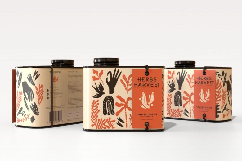
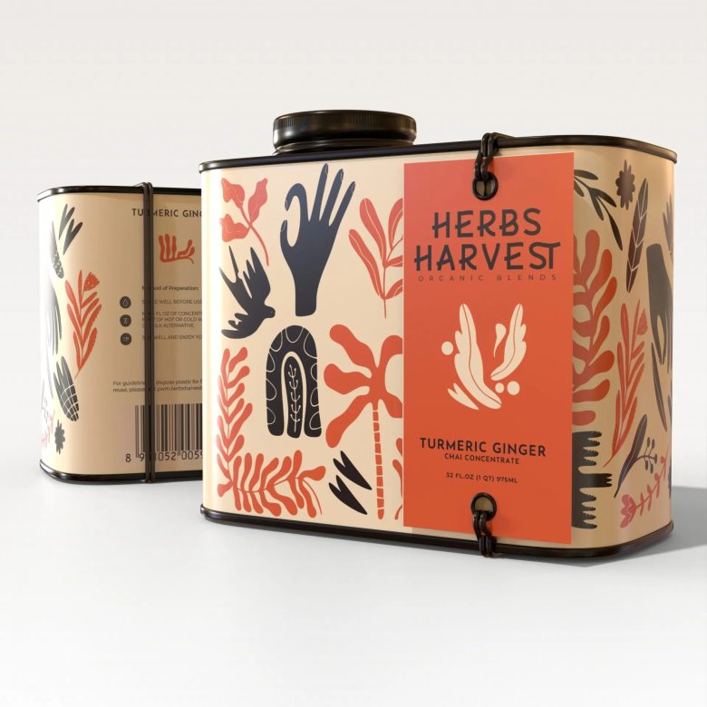
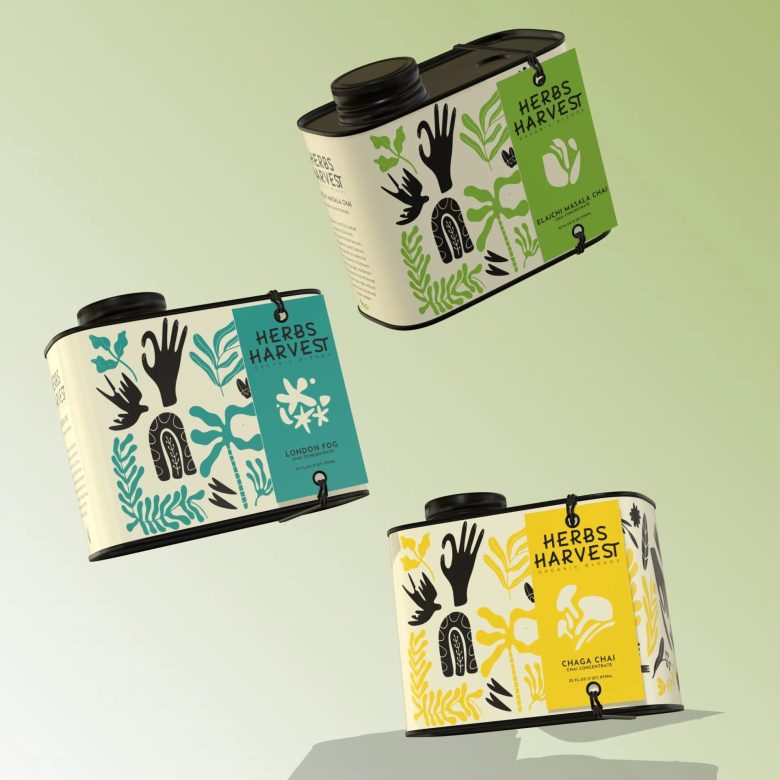
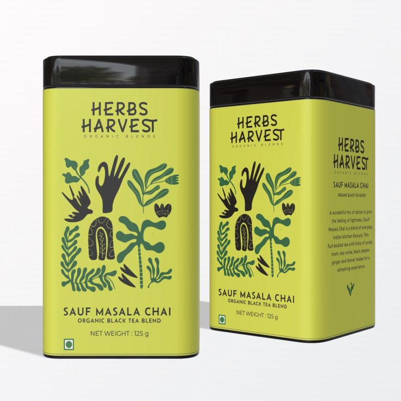
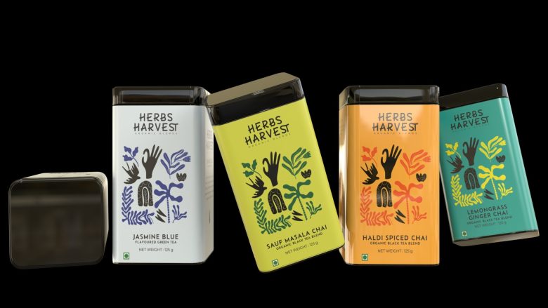
Herbs Harvest approached us for the packaging and brand language for their range of premium organic blend teas. An area of emphasis for their product story was the origin and purity of their product, and that they were very much a wellness brand. The initial thought when naming the brand came from the idea of a harvesting tea garden: an array of herbs blending to form a delicious tea.
At the heart of Herbs Harvest was an element of whimsy and worldliness: varied and diverse herbs from across the globe distilled into a single tin. The flavour story became important for the product as well as the overarching brand. And that’s where the journey for their visual identity began.
Before we could create a brand foundation and personality for Herbs Harvest, it was important to understand what our competitors were doing. Analysing and understanding how they present themselves would help us know how we want to be perceived. We examined other brands in the tea industry, Ayurvedic mixers, and gifting areas, not limiting ourselves only to direct competitors.
Designed by thedesigntheories

Add to collection