The Pride Flag: a colourful history of a design icon
Who designed the Pride Flag? What is its meaning? How did that flag become a symbol of LGBTQ pride?

Kieron is a freelance writer and Digital Consultant who doesn't consider himself a design lover but a user of design - which to him is more than enough.
LinkedinBrand identity
Conceptual
Colourful
Pop
Textile
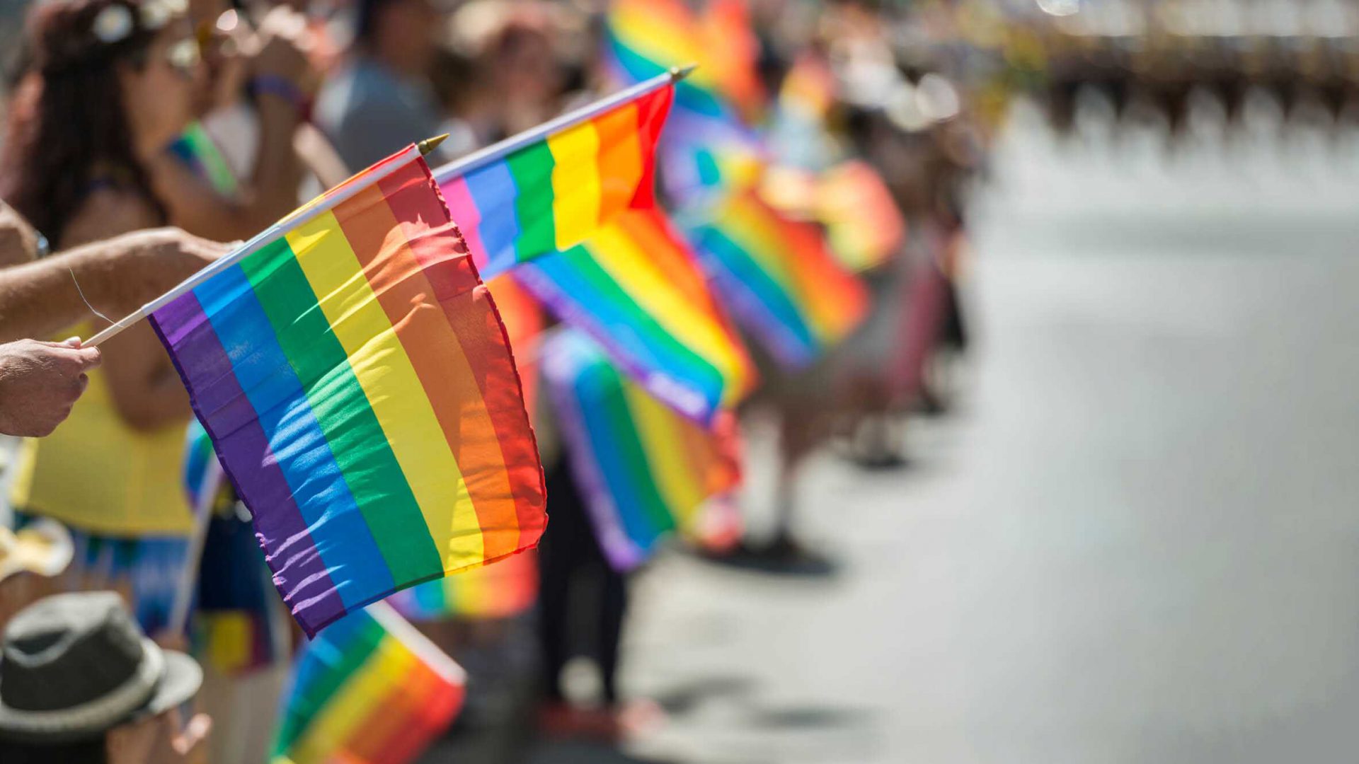
June has long been recognised as Pride Month and on this colourful occasion, the rainbow Pride Flag takes centre stage.
Expect to see it everywhere: stretched across balconies, decorating shop windows and draped over the shoulders of those displaying solidarity with the LGBTQ community.
A queer icon and a ubiquitous symbol around the world, the Pride Flag first flew in 1978 during San Francisco Pride.
It had eight colours and was designed by the artist and queer activist Gilbert Baker who was commissioned to design something that could represent the LGBTQ community by his friend Harvey Milk, the first openly gay elected official in California.
On that day, Baker along with thirty volunteers hand-dyed and stitched two giant flags and hoisted them above the city’s UN Plaza, near city hall.
The inspiration behind the design came from the United States national flag, which had celebrated its bicentennial in 1976, the Pop Art movement, which defined the decades leading up to the seventies with an optimistic investment in new and contemporary ideas, and of course, an actual rainbow.

Before that, the most popular emblem of queerness was the pink triangle, a reclaimed symbol from Nazi Germany’s persecution of gay men.
Despite the Pink Triangle’s prevalence, Baker had a problem with its tainted history.
“We needed something beautiful. Something from us” he argued.
And so, the rainbow Pride flag was created with eight different colours, each with its own meaning assigned to it by Baker:
- Hot pink stood for sexuality
- Red for life
- Orange for healing
- Yellow for the sun
- Green for nature
- Turquoise blue for art
- Indigo for harmony
- Violet for spirit
The flag would later be simplified to become the six-tripe version, which is mostly used today.
Pink and turquoise were removed because the hot-pink dye was hard to source and because seven stripes were harder to mass-produce.
Still, the remaining spectrum of colour came to reflect the immense diversity and the unity of the LGBTQ community.
Curious to know about initiatives supporting LGBTQ+ creatives? Head to these 4 LGBTQ+ organizations that you should know, follow, and might as well join.


This didn’t happen immediately.
Not until 1994 did the rainbow flag become truly established as the symbol of pride.
That year Baker made a mile-long version for the 25th anniversary of the Stonewall riots, which inspired Pride and the LGBTQ rights movement.
As the LGBTQ+ movement has become more inclusive and aware of itself, various segments have created their own flags to fly alongside the Pride Flag.
Most of them incorporate Baker’s original design but add more colors and elements to acknowledge various people within the community such as Native Americans and the broader POC community.

This uptick in new pride flags includes the Progress Pride Flag created by graphic designer Daniel Quasar in 2018.
He added a five-colored chevron to the classic rainbow flag to place a greater emphasis on “inclusion and progression.”
Quasar’s Progress Pride Flag added five arrow-shaped lines to the six-colored Rainbow Flag, including black and brown stripes to represent marginalized LGBTQ+ communities of color, along with the colors pink, light blue and white, which are used on the Transgender Pride Flag.
Alongside its various iterations over the years, companies and other corporations have been inspired to come up with ways of celebrating diversity and waving their own Pride Flag.
Like clockwork, every June the rainbows come out, begging the necessary question if there is a line between allyship and marketing that shouldn’t be crossed (a useful and somewhat obvious rule of thumb is that LGBTQ support and representation should filter throughout the entire business).

This year, LEGO’s Vice President of Design Matthew Ashton unveiled “Everyone is Awesome”, the Danish toymaker’s inaugural LGBTQIA+ set.
A part of the community himself, Ashton was inspired by Baker’s original rainbow flag, pairing the original colours alongside pale blue, white and pink to represent the trans community, and black and brown to acknowledge the diversity of skin tones and backgrounds within the community.
Meanwhile:
- sports giant Adidas has released a Pride collection alongside a global campaign spotlighting influential members and allies of the LGBTQ+ community
- Disney has decorated everything from apparel to accessories in rainbow shades, donating funds in support of LGBTQ communities and causes around the world
- ARELAS, a Spanish association offering resources to trans youth
- as well as Nijiiro Diversity, a nonprofit organization in Japan focused on reducing LGBTQ discrimination in the workplace, and others.

Despite concerns when it comes to “Rainbow-Washing”, it’s cause for celebration that Baker’s original design lives on today in so many different mediums and so many different evolutions.
It’s reflective of the increasing visibility of the LGBTQ community but also a reminder of the necessary work that needs to be done.
Gilbert Baker passed away in 2017, aged 65.
A few years prior to his death, he revealed the rationale behind the design of the flag in an interview with MoMA, reiterating the rainbow as an appropriate symbol of joy, beauty and power:
“The rainbow is so perfect because it really fits our diversity in terms of race, gender, ages, all of those things. Plus, it’s a natural flag—it’s from the sky!”
Discover how designers are using their voice to advocate for queer rights, don’t miss “WAKE THE F*CK UP!” and start designing for all – Interview with Max Masure (They/Them).