
Add to collection
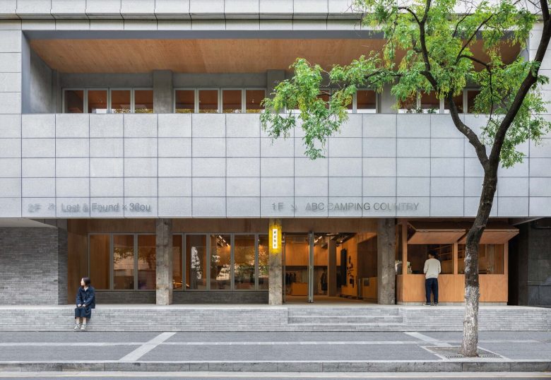
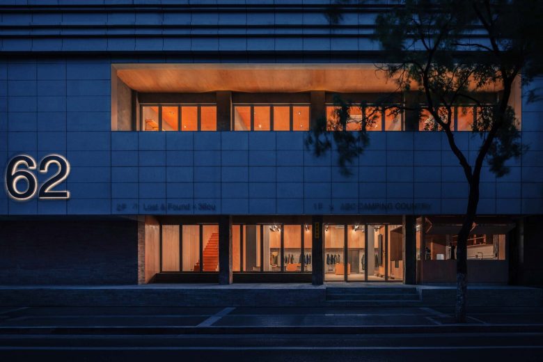
Project background and city context – In 2022, mou architecture studio was invited to co-design a collection of shops in Nanjing for three lifestyle brands. With two floors of around 600 square meters, it was agreed that the ground floor would house the outdoor lifestyle brand ABC CAMPING COUNTRY and the first floor would be a lost&found x 36ou lifestyle proposal shop. The location of the venue is the Fine Arts Building, 62 Beiting Lane, Nanjing, where Yangtze River Road and Beiting Lane intersect. “One Changjiang Road, half of Nanjing’s history”, whether during the Six Dynasties or the Republic of China, these two roads have witnessed the rise and fall of prosperity in Nanjing’s history. The long history has inevitably shaped the different texture of the city at different times. Through this renovation design, we hope to capture the pulse and texture of the city, so that it can not only become a shop that embraces all kinds of goods but also help the street and the building to rejuvenate again and become a place for residents and customers coming and going to gather and communicate.
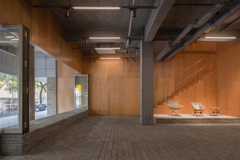
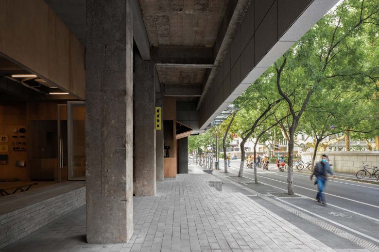
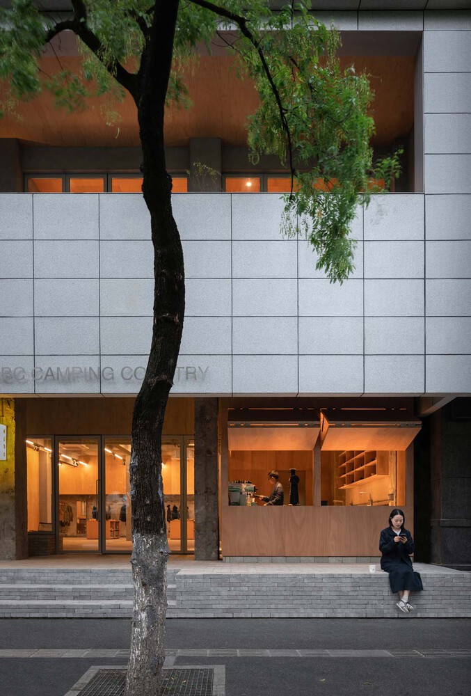
Thinking about the relationship between street and shop – A narrow street running north-south for less than a kilometer, with a one-way motorway and cycle lane in the middle and pedestrian walkways on either side of the road, the historical deposit combined with the comfortable scale of the narrow block makes this a smoky alley today. The building, the Arts Building, faces east and west, with the large windows of the main entrance facing the street. Opposite is the first National Art Museum, designed and built by Mr. Yang Tingbao, the first Chinese architect, whose buildings and courtyard we can see through the low fence. We also note that most of the buildings on both sides of the street are adjacent to the pedestrian walkway and that long queues of shops inevitably crowd the pavement, which not only affects the traffic on the road but also makes it even more difficult in the rain when there is no shelter. This has led to a reflection on the relationship between shops and the street. If the building could be fitted with a large eave it would solve the problem of western exposure on two levels and provide a place for customers and residents to queue for shelter on the ground floor. It is clear that adding to the exterior does not work, so the problem has to be shifted to the interior. The eaves of the traditional sloping roof of the building provided us with a good idea, so the two levels of space were simultaneously set back inwards to form a gable open to the outside.
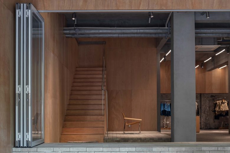
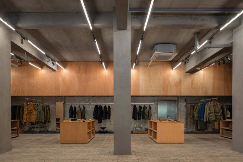
Both street and living room – On the first survey of the site, the huge staircase perched in the center of the ground floor stood out. The space is thus cut into two main areas, front and back. The rear area is completely obscured by the staircase. The owner of the ground floor space wanted to accommodate functions close to everyday coffee, clothing, outdoor equipment display, and retail. We then decided to remove the staircase and install a new staircase connecting the two levels of space. The new staircase is positioned to the far left of the entrance with minimal volume and visual obscurity in order to create an urban living room that can be penetrated by the traveler from the street. The display arrangement makes use of mainly wall space to avoid creating visual barriers in the middle area, we do not impose all the functional limits and leave the flexible use mechanism of the central core to the shop operators. The internal space and the external gable are integrated with the external street through a system of folding glass doors, welcoming anyone to enter and releasing a sense of goodwill and friendliness to the city and the street.
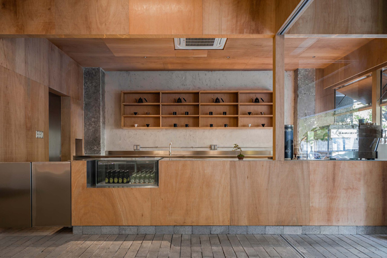
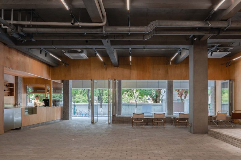
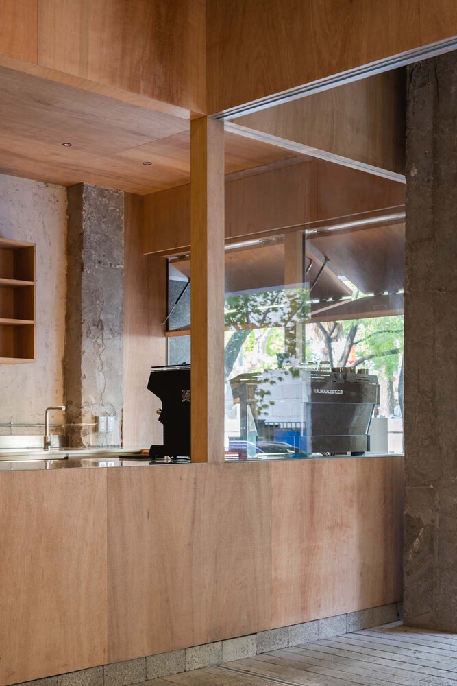
Routine and equality – One of the most impressive things about a city’s streets may be the steaming bun shops, where the skillful and busy figures of the chefs always bring life to the people. A cup of coffee is made through a number of different processes before it is delivered to the customer. We also wanted to face the street, so that pedestrians on the road could notice the complete process. The decision was made to place a ‘kiosk’ between the two pillars, running inside and out, as a window to both the inside and the street, for the daily operation and sale of coffee. The height of the flooring of the kiosk was set at the same level inside and outside, and we wanted the line of sight between the shop staff and the customers to be at the same level. A floor covering the original concrete floor with concrete blocks extends outside to meet the pavement, where pedestrians and customers can sit and talk on the brick-built curb. The raised sections become booths and benches. The façade renovation takes a low-intervention, harmonious and different strategy. Whereas most shops would have preferred a tall frontage, this time we took the initiative to lower both the façade and the frontage to a height of 2.6 meters above the ground, creating a special visual relationship that is subdued and serves as a refuge for people drinking coffee and relaxing under the gable, maintaining a relatively equal line of dialogue with the National Gallery of Fine Arts opposite.
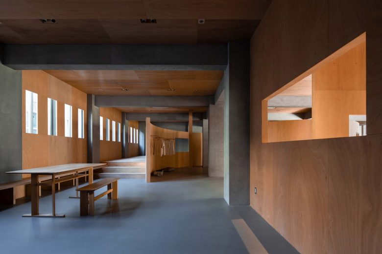
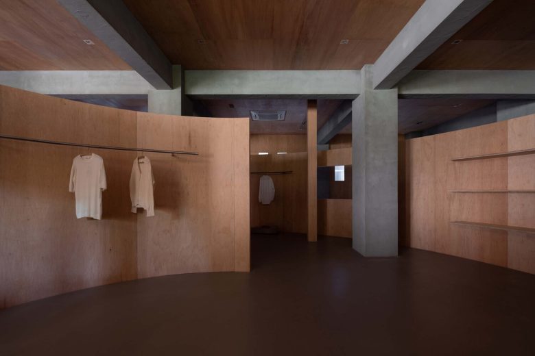
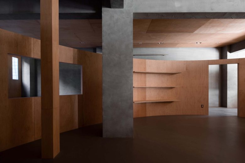
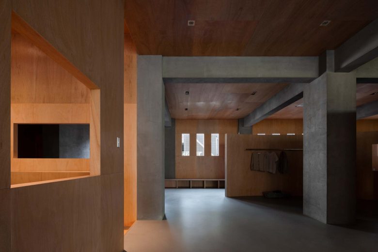
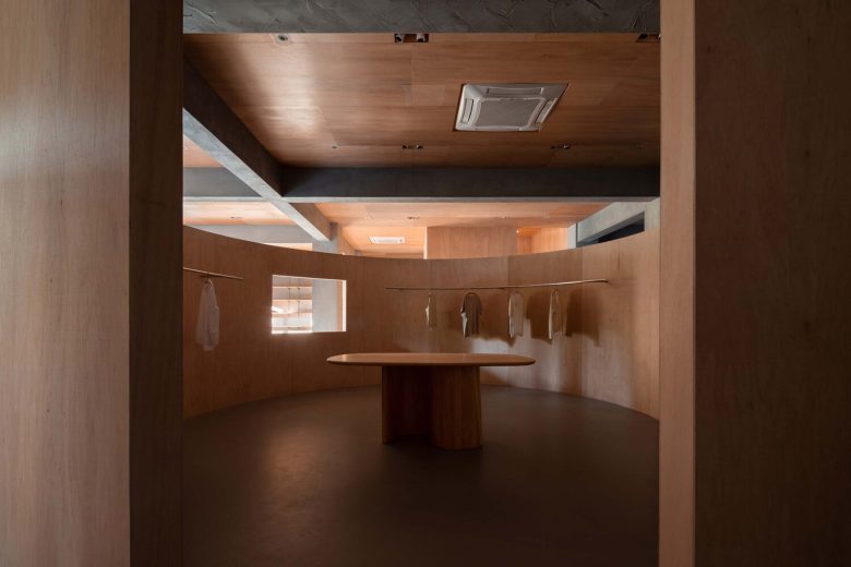
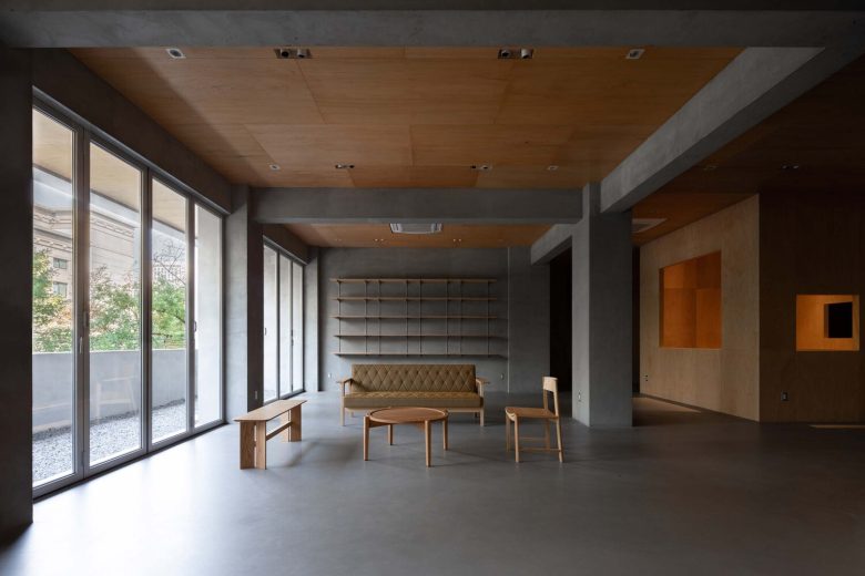
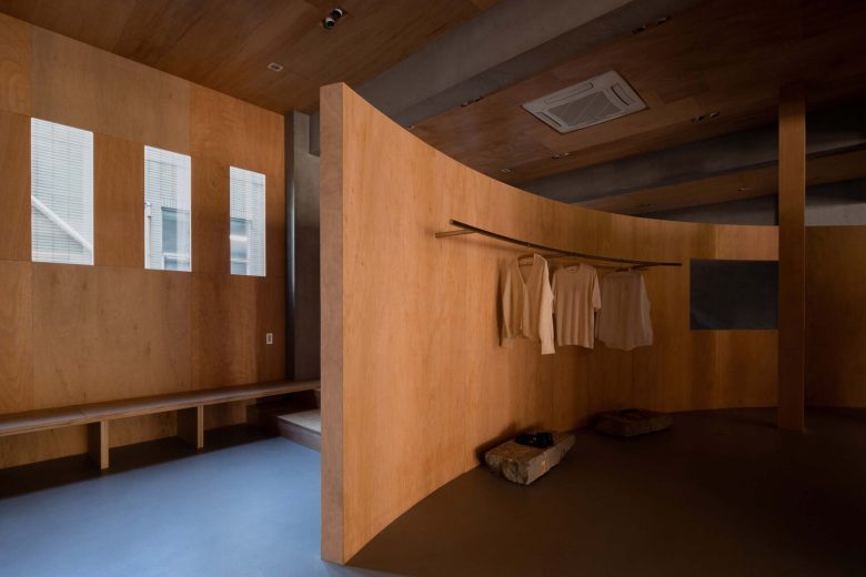
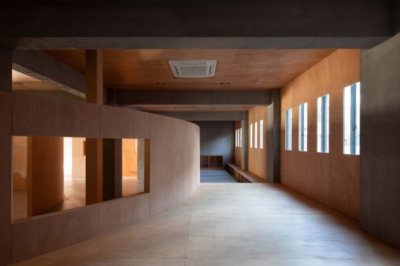
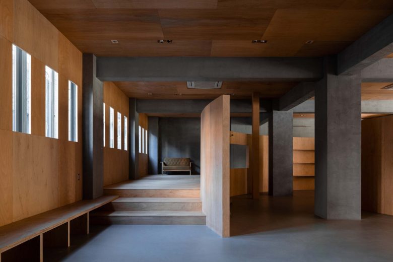
The square and the curved atrium – On the first floor the owners wanted a space that could cater to the display and sale of furniture, clothing, and home furnishing options; daily offices; negotiation; storage, and the flexibility to cope with events set-ups. The ground floor has a high degree of transparency and welcomes people in, then on the first floor, we are keen for people to go deeper and explore with a sense of continuity. The site is a standard space held up by beams and columns and the first step we needed to take was to break out of this initial homogeneity and create the impression of a shop that is exploratory and takes its time to wander. Rather than making a parapet of conventional height, the parapet was transformed into a wall that reached the top, as it divided the space and acted as a visual cover, so the square garden took shape. But a single square garden in a large, empty space is not enough to create complexity and interest, and since we can only be around it and not really in it, we thought of incorporating another abstract atrium. But what kind of atrium will this atrium be, and how can it be abstracted in a way that satisfies the function and organizes the new spatial system together with the squared atrium? The simplest way to start is with the basic geometric forms, the first combination of circles and squares was felt to be appropriate, although circles inevitably feel classical and symbolic. We wanted to create a place that was not stylized or individualistic, that was not western or Chinese, and that embraced all kinds of products and all kinds of people. We, therefore, cut an opening in the circle and pulled it into a be-like “6” form, with a distance between it and the square court, and a doorway inside it, which is enclosed by a half-height curved wall, which we call the curved atrium. The other corresponding functions are also filled in on the basis of the pattern of two atriums. In this way, a number of paths, either wide or narrow, straight or curved, are formed between two atriums.
The products of Lost&Found are mainly in the furniture and home category, while the products of 36ou are mainly apparel and lifestyle products. We needed to think about how to plan the layout of the two brands, one large and one small, in the same space. If the two brands were to be displayed independently, it would look intuitive but slightly uninteresting. We, therefore, chose to integrate the products of both brands to create a more vivid and fuller home life. The lost&found furniture has a living room, dining room, bedroom, study, and other applications for different types of home scenes, if the scenes are too concentrated, they may become a duplication of the functions of conventional family rooms, so it is better to use the traffic path to divide and conquer them. The inner wall of the atrium is used for the display of clothing, like a huge semi-open cloakroom. On the outer side of the atrium, near the street, we have chosen to use the area as a flexible functional area, which can be used as a display for LDK lifestyle scenes, or for events and exhibitions.
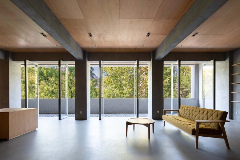
Scenery and Body – From the stairs up to the first floor, customers explore a selective and disorienting path that can be tailored to their own feelings and preferences. The walls of the square and curved atrium are unadorned but have unexpected and penetrating openings where air and sunlight can flow naturally, and we hope that the views peeking through the openings will drive the body to wander through and stumble upon the objects it desires. In the south-east corner of the curved atrium, we have raised the flat terrain upwards to create a section of the terrace. The terrace creeps into this corner with some relative privacy and can be used in the future as a bedroom scene display. The access to the terrace in both directions utilizes steps, but in order to provide a rhythmic change of pace, both physically and psychologically, we have set up steps of different heights and a number of steps. Standing on the terrace will also bring a special view.
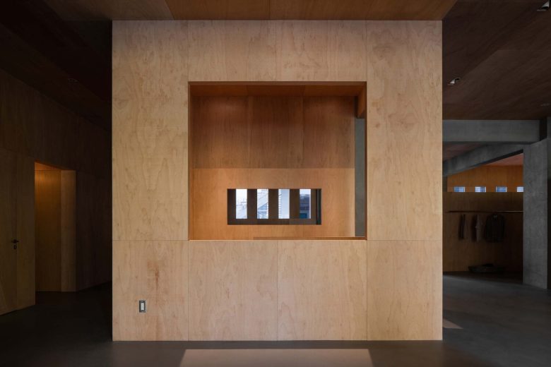
The window on the east side of the site is almost forced by the school buildings, which are not aesthetically pleasing in the slightest and at the same time distract from the interior. When faced with a view, the good is received, and the bad is screened. The Jade and Exquisite Study rose window is really the finishing touch. We have also tried to keep an ambiguous sense of distance between the two by constructing a layer of flower windows, which also add a sense of sequence to the space. The original windows near the west side are adjacent to the street, with a view of the city street through the glass, and the inward setback creates a gable that allows everyone who comes here to step out and experience the city and nature. Within this open and inclusive site, we hope to bring the pleasure of being viable, desirable, and playable, and look forward to the many forms of life that will take place here in the future.
Architects: MOU Architecture Studio
Principal Designer: Zhuang Wu
Design Team: Shiyu Fu, Jing Chen, Yiwen Li
Photographs: Ang Wu


Add to collection