
“World’s biggest” disability campaign #WeThe15’s identity designed by Pentagram
Launching in collaboration with the International Paralympic Committee, the global campaign has been crafted by Harry Pearce.
Pentagram has designed the identity for #WeThe15, a global campaign which seeks to become the “world’s biggest human rights movement”.
The graphic identity, which includes a circular symbol and wordmark, has been designed by Harry Pearce, while Yuri Suzuki is responsible for the sonic branding.
#WeThe15 has been launched in partnership with the International Paralympic Committee to coincide with the opening of the Tokyo Paralympics 2020 in August. It’s backed by a further twenty organisations, such as the UN and UNESCO.
The movement’s name refers to the 15% of the world’s population that have a disability, which amounts to some 1.2 billion people. With a focus on inclusivity, it aims to draw attention to the challenges they face, which include access to healthcare, education and employment, according to the group. “They are the world’s largest marginalised group,” the organisation adds.

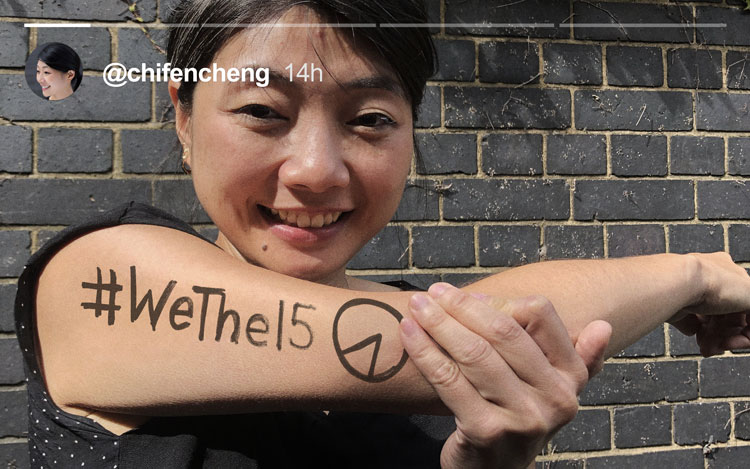
The graphics aim to have maximum visibility across social media, explains the design team. The logo visually recreates the proportion of the world that has a disability. “The symbol is a clear representation of what the percentage actually looks like,” Pentagram says. The 23.5 angle represents “the tilt of the world’s axis”, the studio adds.
Throughout the Paralympic Games, athletes will wear temporary tattoos with the identity’s symbol. Purple was chosen for the identity, as it “represents the international colour of disability”, according to Pentagram.
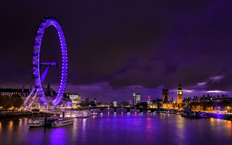
Around the world, 90 well-known monuments will be lit up in purple for the campaign. That includes the Houses of Parliament and the London Eye, Edinburgh Castle and New York’s Empire State Building.
Yuri Suzuki and team have created the sonic branding, with elements that “allow the identity to be experienced by the hearing impaired”, says Pentagram.
The studio continues: “The DNA rhythmically spells out ‘We The 15’ and is easy to sing, through use of close intervals.”
DNA refers to the melody, explains the design team. “By spelling out, what we mean is that the phonetic of syllabic rhythm is matched by the melody/DNA’s rhythm – e.g ‘We The Fif-Teen’ is four syllables and our melody is four notes,” it adds.
The chords have been arranged over three octaves, as a way for people with different hearing loss to hear the “fundamental tone and structure of the sound”, Pentagram adds.

It’s also monophonic – meaning it has a single melodic line without harmonies – so that people with hearing impairments can receive the sonic information that is often lost in stereo, according to the team.
Ad agency Adam&EveDDB has also created a brand film for the campaign’s launch which will be broadcast for the first time at the Paralympics opening ceremony in Tokyo.

-
Post a comment


