
DixonBaxi’s branding for Canada Water aims to make it London’s “new town centre”
As the south London area enters into a 12-year era of development, the studio has built a “future-proofed” brand influenced by heritage.
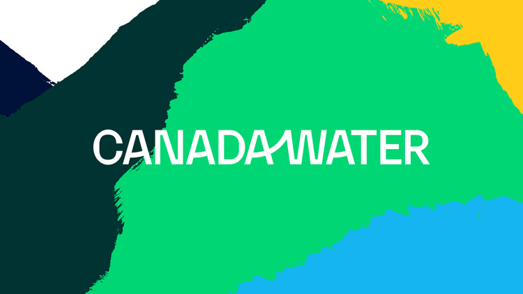
DixonBaxi has unveiled place branding for Canada Water, an area in the Docklands of south London.
The project is the latest in the studio’s work with British Land, which has so far included branding and strategy for Regent’s Place.
A “once-in-a-generation” development project
Canada Water is soon set to undergo a “once-in-a-generation” development project, which aims to position the area as “a new town centre in the heart of London,” according to DixonBaxi design director Astrid D’Hondt.
The Canada Water Masterplan hopes to make an “active, positive, long-term contribution” to locals’ lives, by building and introducing more homes, shops, office space and public spaces and facilities to the 53-acre area.
“We had to look ten years ahead”
Work will take place over the next 12 years, D’Hondt says. This meant the place branding for the area needed to capable of evolving with the area, she adds.
“We had to look ten years ahead, blending insights from the past with the future,” says D’Hondt. The team did this by “digging deep” into the archives of the area, as well as engaging community leaders, schools and the local council.
“The area has been built and rebuilt over time”
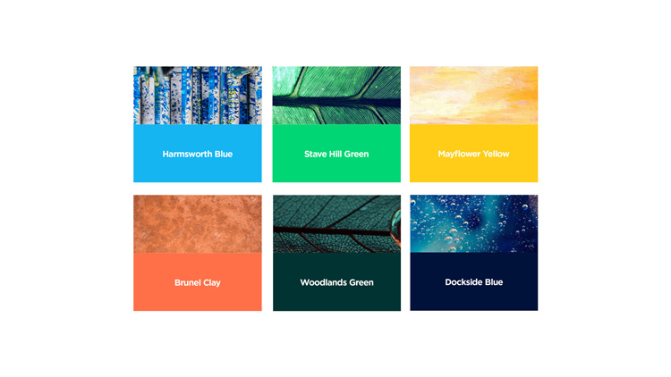
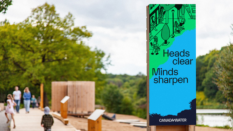
These findings have then influenced the work throughout, D’Hondt explains. The colour palette, for instance, uses historical icons and local areas, with colour names such as Harmsworth Blue (after the nearby quay), Brunel Clay, Mayflower Yellow and Stave Hill Green.
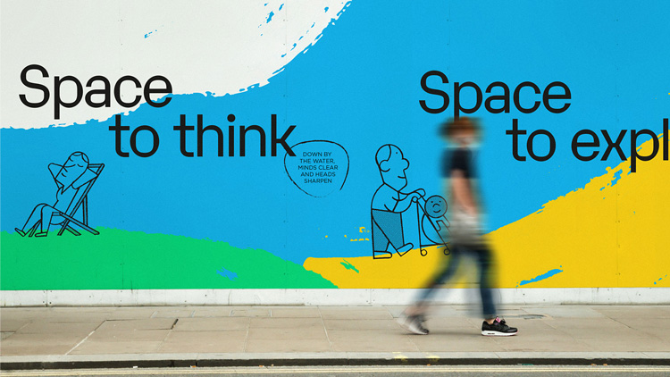
The natural landscape of the area has informed elements too.
To craft certain elements, the team spent days in the area, painting and sketching ideas “by the water, in the woods, parks and surrounding areas”, the designer explains.
“To express all of this in the identity, we developed hand-made ‘gestures’, which represent the overlapping communities experience and lifestyles of Canada Water,” she says. “Layered on top of each other, the gestures also represent the way the area has been built and rebuilt over time.”
“Balancing human feeling with more structured forms”
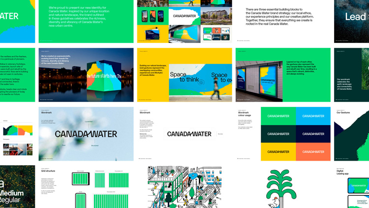
The link between the natural landscape and the built environment is further alluded to in the Canada Water wordmark, which features a “discreet upward line” linking the A and W.
The upward motif is further used in the other As. This creates a “more human feeling”, D’Hondt says.
Elsewhere, Karelia has been chosen as the primary typeface for the brand. The selection was made because of its “organic curvature and contrasting geometric forms”, she adds.
“We were really looking for a typeface that balances a human feeling with more structured forms as a nod to the industrial past of the area,” D’Hondt says. “Typographic layouts feel conversational and evoke a sense of rhythm and journey.”
“The brand will continue to grow”
As the redevelopment work begins across the area, the branding will be seen across new buildings, hoardings, signage systems and environmental experiences.
“And the brand will continue to grow, evolve and adapt over the next decade,” D’Hondt says.
What do you think of the new branding for Canada Water? Let us know in the comments below…

-
Post a comment


