
Otherway looks to add “humanity and depth” to low alcohol spirit Decem’s branding
The studio is hoping to create a “modern classic” through its work for the 10% ABV spirits range.
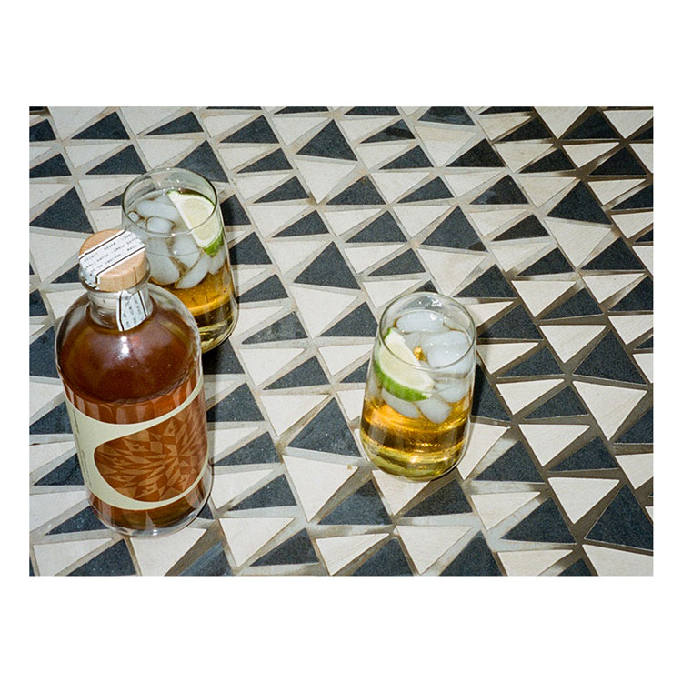
Otherway has redesigned the branding for “light spirit” company Decem, incorporating radial patterns and a classic “English aesthetic”.
The London-based consultancy has worked on strategy, branding, illustrations, packaging, and digital design for the English drinks brand. Otherway has also invested in the company.

Decem’s range of spirits, which include a dry gin and rum, all have an alcohol by volume (ABV) measure of 10%, around a quarter of mainstream spirits.
“One theme to come out of a post-Covid world is a preference for lighter alcoholic drinks,” says Otherway founder Jono Holt. “This is largely driven by health-conscious drinkers who, in addition to wanting to avoid have one too many, don’t want to over consume liquid calories.”

Crucially Decem’s audience are people who like drinking and the culture but simply want “to moderate their alcohol intake for whatever reason”, he adds. Holt says, “We created Decem to feel a bit like a modern classic. The spirits category is typically built on tradition and if not, then a pastiche of heritage.”
The branding takes inspiration from the 10% ABV; ten natural ingredients have also been blended or distilled into each bottle. The brand’s name comes from the Latin word Decem which means ten, for example.

Otherway has crafted a pattern, seen on Decem bottles, which contains a series of ten radial points. As well as nodding to the ABV content, the pattern is designed to make a bottle people can be proud to bring to a party, explains Holt.
The bottle itself is split into two clear sides. The front displays all the natural ingredients in each bottle, while the pattern can be seen in “intricate foiling” on the reverse, adds Holt.
Other branding elements have been designed to stand out from the wider drinks category, according to Holt. “In a category that trades off tradition, whether that be through true heritage or pastiche – we wanted to steer away from this world to create a bottle that would stand out across a direct-to-consumer social world and on-trade back of bar environments,” he says.
This is partly achieved through a balanced use of sans and serif fonts which “give an English aesthetic while creating a more contemporary take on a spirits brand”, he explains.
Meanwhile the photography style “brings a fresh eye to the social aspect” of drinking brands, says Holt. The team shot the product on Kodak Potra 400 35mm film to add a “candid and colourful lens on the Decem world”, he adds.
The resulting images – a mix of saturated tones and “surreal, intense” visuals – hope to bring some “humanity and depth” to the new branding, Holt says. New taglines include Long Nights to Remember and Modern Spirits for Modern Times.

-
Post a comment


