
Taxi Studio’s branding for a cancer charity includes a “bowel-inspired” typeface
The Bristol-based studio has developed a bespoke typeface, colour palette and tone of voice for the organisation, with the hope of showing bowel cancer affects all ages.
Taxi Studio has designed the identity for Never Too Young, a charity set up to raise awareness for bowel cancer in younger people.
It’s a common misconception that bowel cancer is a disease that only affects older people. Around 2,500 people under the age of 50 get diagnosed in the UK each year, according to the charity. However, as a large portion of sufferers are older, literature and support is geared more towards this demographic.
Never Too Young was founded by Sophia Sangchi in 2018, after her own stage four bowel cancer diagnosis. The organisation encourages younger cancer patients to share their experiences, raise awareness and support each other. A friend of Sangchi, Taxi Studio designer Charlie Tallis, introduced her to the studio and ran the pro bono project.
Sangchi died a year into the project in November 2019. Tallis says the project stands as part of her legacy.

“A visually challenging typeface”
The brief for the project was to create a brand that captured attention, drove awareness and could help build a community, Tallis says. Additionally, the identity needed to be accessible and welcoming. “It needed to not appear like a cancer charity so that we could engage a young audience,” she explains.
The project’s focal point is a bespoke typeface, designed in partnership with long-time Taxi collaborator Tom Lane. Having his own personal connection to the subject matter, Tallis says Lane “poured his heart and soul” into the typeface.
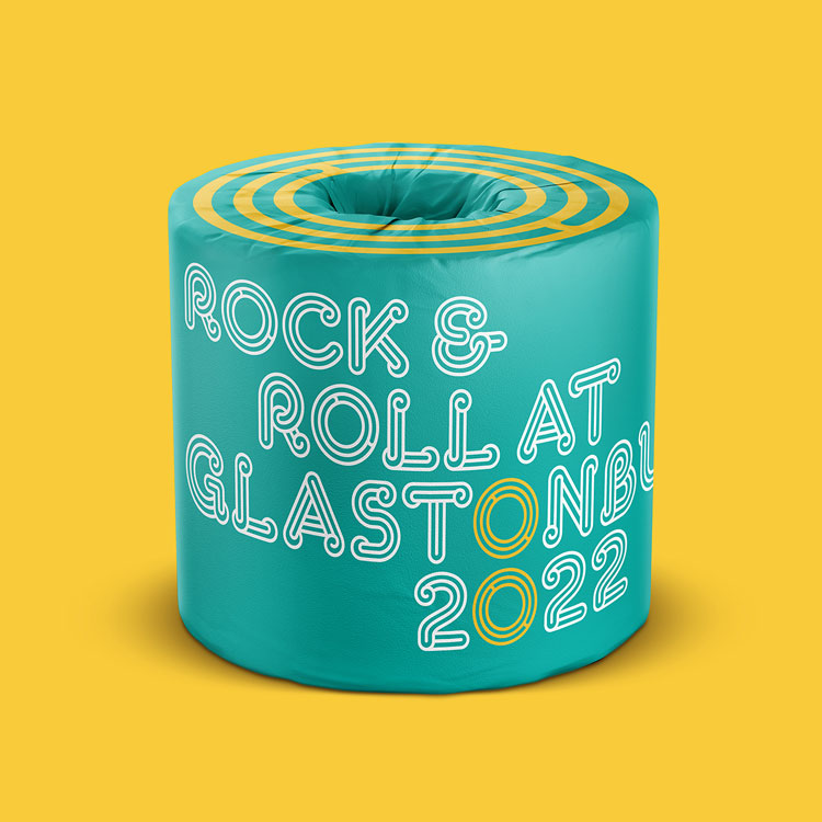
In line with the charity’s focus and named after its founder, Sophia Bold and Sophia Display are “bowel-inspired” typographic solutions, Tallis says. “It’s a visually challenging typeface, with twists, turns and an intentionally uncomfortable aesthetic.”
The typeface is used in the charity’s wordmark, while the colon – made of two “o”s in the type, have been adopted as a “visual shortcut” for the brand. Both are found throughout the identity.

“Know your sh*t”
Sophia Bold and Sophia Display are both used throughout the identity in brand communications, on social media and promotional items like bags and t-shirts.
These touchpoints are supported by a “strong and authentic” tone of voice, developed in collaboration with Reed Words. With Never Too Young’s focus on spreading awareness among younger people, Tallis says the voice “treads the line between assertive and supportive”.
Humour is also used throughout as a means of conveying facts and encouraging action in a lighter way, she adds. Brand communications include phrases like “Know your sh*t”, “Trust your gut” and “We know it’s poo”.
“It was important that the words that we used to represent the Never Too Young brand would resonate with a younger audience, by bringing them the facts in a witty way and also being a support network for patients with bowel cancer,” says Tallis.

“Unexpected” touchpoints
Beyond the typeface and tone of voice the Taxi team are also currently working with Bowel Cancer UK to create further activations for the brand.
Alongside the more traditional tote bags and t-shirts, Tallis explains the team are also developing “unexpected” touchpoints, with which the Never Too Young team might be able to raise money and awareness. These include phone cases, toilet rolls and other items that can be branded for the charity’s presence at festivals.
“The Never Too Young project team has been genuinely inspiring collaborators, with most of them undergoing treatment throughout the project – sometimes needing to leave Zoom calls for chemo sessions – while continuing with their day jobs during a pandemic,” says Tallis. “An incredible, inspiring group of people. It’s been an honour to work with them in developing this, hopefully, life-saving initiative.”


Read this next

-
Post a comment


