
Human vs algorithm: how AI is impacting type design
Generative technology plays an important role in typography, but it will have to balance human creativity, argues The TypoCircle chairwoman Louise Sloper.
In his 1991 book Typography Now, Rick Poynor noted, “In the age of the desktop computer… type has acquired an ease of manipulation and, potentially, a lack of conceptual boundaries unimaginable only a few years ago.
“Traditionalists argue that the accessibility of the technology will accelerate the decline in typographic standards… evangelists enthuse about a soon to be realised digital paradise,” Poynor wrote.

Recent talk of the metaverse has put immersive, digitally-focussed tech in the spotlight. Whatever your feelings about the algorithmic AI revolution, it is here, and here to stay. And it has crept into the veins of the creative world. For example recent project Lost Tapes of the 27 Club used AI to create new tracks ‘from’ artists such as Jimi Hendrix and Nirvana.
In 2016, Wunderman Thompson used AI to create a ‘new’ Rembrandt, and van Gogh’s style has been convincingly recreated from photos to painting through machine learning. Automated talent agency Genie is another example, championing great typographers and designers on the platform, while also being a changemaking, algorithmic digital product itself.
The mind-boggling advances in technology have improved – or at least sped up – work processes in almost every profession. Within the design and typographic fields, there’s an ever-growing investigation into and experimentation with algorithms, including the more advanced algorithm-based AI machine-learning. This generative design form has created quite a stir and divided camps. I have a long-standing interest in the use of algorithms within type design, and it’s an area I cannot make my mind up on.
How type design is evolving

Type design is evolving. Variable typefaces are fast becoming the way forward for many brands, with their load-up speeds, variety and flexibility opening previously closed doors. Algorithmic, or parametric, typography is much wider reaching. It’s radically different from what we are used to and absolutely fascinating. Instead of a designer working on individual shapes in design programmes, a mathematician comes up with formulae to define attributes from an entire batch of letters. Maths plus art can equal fun, and the results can be quite bizarre.
As a general rule, I often think of algorithmic type designs more as decorative, experimental art pieces. Father-and-son mathematician team at MIT, Erik and Martin Demaine, have created an entire suite of strange and playful “algorithmic puzzle fonts” to demonstrate theorems. Concepts ranging from origami and sudoku, to a font based on a motion trace of juggler Ron Graham’s tricks, have made science correlate with playfulness.
Award-winning artist, designer and researcher Yeohyun Ahn has created decorative letterforms based on bubbles and reproductive organs, integrating creative coding into experiential graphic design through a code library called Geomerative. The library lets the user create new letterforms, then converts them to TrueType and SVG fonts.
Algorithms can save time in type design
Currently, algorithms are applied best in type design to expedite processes such as categorising and tasks like spacing or computing lighting, dimension and curvature in vectors. The automation of mathematical tasks within the process of creating a new typeface has become increasingly prevalent, much like the use of robots in car manufacturing.
Modern fonts can consist of over 600 characters, and so an algorithm that defines certain aspects such as serifs, curves and angles can save many tedious hours spent matching characters. It may even be capable of altering whole sets at once, much like the faux bold in Word. Hoefler & Co applied an algorithm-based approach to the three-dimensional font Obsidian to rapidly light its decorative form, removing the manual task of drawing shadows onto each character.
Algorithms and AI can also be used to identify and categorise fonts. WhatTheFont is a prime example of this. Kevin Ho at IDEO developed Font Map to showcase similarities and relationships between different typefaces; a particularly useful tool when you want to make small adjustments to your typeface choice within a project.
Spacing is a challenging, yet crucial job in typography. The possibility that AI can learn to make visual compensations, when there’s no one-size-fits-all approach, will be interesting to keep track of.
Brands need to think digital-first

In terms of branding, many organisations need to think digital-first. Austrian design studio Process specialises in generative and interactive design. The design team took typeface generation to new levels with its Aifont system, which creates new typefaces through deep-learning and a dataset of over 200,000 fonts. This system was used to create a visual identity for the Uncanny Values exhibition at the Vienna Biennale in 2019. Another exceptionable example is Strichpunkt’s rebrand for Audi, which leveraged the possibilities in generative design.
All this means more time for conceptual play and crafting by the practitioner. Afterall, we live in a society where speed is critical and impatience for the new is high. Equally it could be seen as the death of human-enabled craftmanship, replacing the highly-skilled hand of the type designer with the undeniable uber-perfection that a machine will inevitably create. Arguably – or hopefully – they cannot replace the creativity of a human being.
Gerard Unger once pointed out that “a typeface will always be a kind of self-portrait of its designer”. When the designer is a computer, I can’t help but wonder how much soul will be in the creation. Will every new typeface ultimately come from one omnipresent source? We will never fully trust robots, but AI will undoubtedly become an indispensable assistant. Providing there’s a finely tuned balance between human and generative in creating, I’m intrigued to see what will come next.
Louise Sloper is chairwoman of The TypoCircle and Genie member.
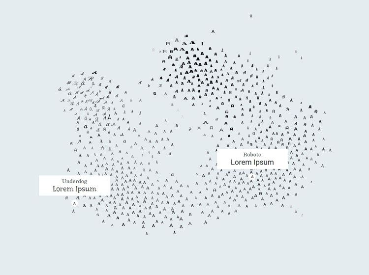
Banner image is courtesy of Process.

-
Post a comment


