Remove Balance Remove Display Remove Form Remove Harmony
article thumbnail

Louis Vuitton’s brand history in heritage window displays

Design Retail Space

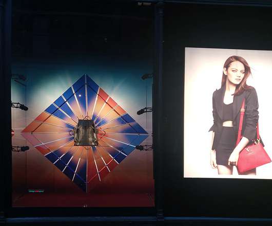
In this post, you discover the incredible Gaston Louis Vuitton and his window displays. His heritage lives not only in archives and books but also in current collections and window displays. Powerful heritage window displays. Trunks on window display. Gaston’s Louis Vuitton’s artistic window display sketches.

Display 52
article thumbnail

Why art beats science in retail: Storytelling, design and sensory experience

Inside Retail

A recent study by The Public Fashion found that most Gen Z shoppers in the UK now rank fashion as their favourite form of entertainment – outranking dining, gaming and music. Crafting memorable retail experiences The human brain processes experiences through multiple senses, each playing a unique role in how we form memories and emotions.

Art 130
Insiders

Sign Up for our Newsletter

This site is protected by reCAPTCHA and the Google Privacy Policy and Terms of Service apply.

Trending Sources

article thumbnail

Forte Forte's Tuscan boutique features subtle nautical details

Dezeen

"We also had an opportunity to work on unprecedented balances and harmonious contrasts. A three-tiered shelf displays lifestyle items. The same material also forms other elements across the interior such as door handles, side tables and slender plinths for displaying shoes.

article thumbnail

10 Ways To Maximize Wellbeing And Productivity Through Workplace Design

All Work

Choose analogous colors for a harmonious, monochromatic look, or complementary colors for a bold, balanced look, and triadic colors for a more energetic, personality-filled space. Create harmony in your space : In your surrounding environment, take into account the finishes, forms, and colors of the room.

Color 116
article thumbnail

Common Retail Signage Mistakes to Avoid

Creative Displays Now

Creating signage through a third party specializing in retail displays to help you avoid layman’s mistakes. You can also use sign slots or a dry-erase feature where the dates can be inserted each time the sign gets displayed. The post Common Retail Signage Mistakes to Avoid appeared first on Creative Displays Now.

article thumbnail

Just scratching the surface

Retail Focus

Strike the right balance. Retail surfaces such as counters, furniture, walls, displays and even floors are extremely important as they need to strike the right balance between creating attractive and customer friendly environments while coping with daily footfall and wear and tear,” Bagshaw said. .

Pattern 233
article thumbnail

Design inspiration: the best projects from April

Design Week

This time around, the Port wordmark has been split up across each cover, with the “O” also forming part of the number 10 – a marker for the milestone birthday. Littlemore identity, by DutchScot. A freshwater pool at the very centre reflects images of a wolf, lynx or bison back at visitors, instead of their own faces.

Design 115