Remove Art Remove Color Remove Contrast Remove Harmony
article thumbnail

2022 TRENDING COLORS

Elmwood Timber

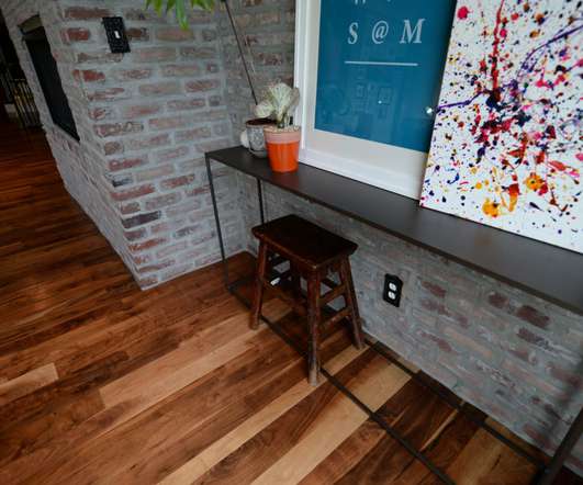
Let’s ring in the new year with a beautiful fresh color option for designers, builders, architects and decorators! Referred to as ‘The Star of the Show’ Very Peri wins first prize with its harmonious symposium in cool blue fashion with just a hint of violet undertones. COLOR HARMONY. CENTER STAGE. PANTONE’S PALETTE S.

Color 82
article thumbnail

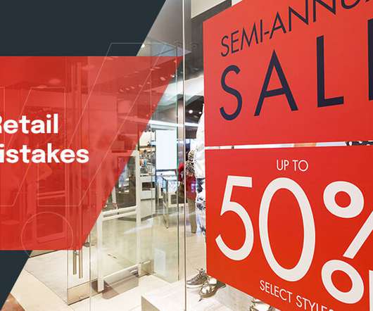
Common Retail Signage Mistakes to Avoid

Creative Displays Now

You want your company’s sign to stand out among the competition, but it’s best to choose a font that is simple, artful and easy to read rather than the fanciest font you can come up with. Awkward or Difficult to See Contrast. The lettering needs to contrast with the background so your customers can read it.

Insiders

Sign Up for our Newsletter

This site is protected by reCAPTCHA and the Google Privacy Policy and Terms of Service apply.

article thumbnail

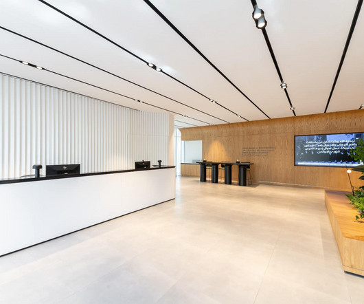
Bluehaus designs ergonomic and inviting interiors for Credit Suisse’s new Riyadh office

Design Middleeast

Spanning 19,160 sqft across three floors, the office space is a harmony of modern design and warm accents, delivering an ergonomic environment that elevates workplace aesthetics and functionality while catering to multiple work scenarios, including hybrid work. “Credit Suisse is one of our longest-standing corporate clients.

article thumbnail

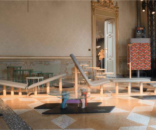
Orografie’s debut collection is designed for a device-driven world

Design Wanted

The brand Orografie was founded by Giorgia Bartolini, who wanted by his side Vincenzo Castellana as Art Director. Elena Salmistraro – ‘Hephaestus’ It is the love for the work that stands in contrast to a deceptive and illusory world, made up of ephemeral pleasures and vices, Olympus. 15 designers for 15 projects.

Design 52